🚀 Intro
The year is 2024: Six months ago, the Earth's mightiest heroes reversed the effects of The Blip, the catastrophic event that caused the vanishing of half of the global population five years ago. This reversal brought back the vanished population, and now Earth is sent into a crisis as everyone is trying to manage the surge in population. In response, select global leaders established the Global Repatriation Council (GRC) to restore order and bring the world back to how it was before The Blip.
Throughout your reading journey, I will include buttons to reveal some supplementary information. These only provide additional information and are not mandatory, but I highly recommend reading them!
This reading journey also expects that you are at least aware of the top two highest-grossing Marvel Cinematic Universe movies of all time: Avengers: Infinity War (released in 2018) and Avengers: Endgame (released in 2019). Just that they exist, that's it 😊.
For clarity, the release date of a Marvel movie or show is different from the date/time of the events depicted in the storylines. I will reference a film or show by its official title and release year. I will also reference the in-universe year/date of the events depicted, and will be treating them as if those dates have already passed or are upcoming in real life. Additionally, "The Blip" is used synonymously with "The Snap". The victims of Thanos' snap are referred to as snapped or blipped. "The Blip" is also widely used to reference the five-year time period during which half of the world's population had disappeared. To maintain consistency, I will primarily use the term blip in this project.
As seen in the film Avengers: Infinity War, supervillain Thanos, with the snap of his fingers, successfully erased half of all living beings in the universe at random in 2018. Coincidentally, both the release year of the film and the year at which the plot took place! The story was continued after an in-universe five-year time gap in the film Avengers: Endgame, in which the Avengers reversed Thanos' finger snap with their own and won the war against him.
Therefore, even though Endgame was released on April 26, 2019 in North America, the plot took place in October 2023. Makes sense so far?
The GRC was introduced in the Marvel Cinematic Universe (MCU) television miniseries The Falcon and the Winter Soldier (TFATWS), and played a major role in the overall story of the show. The events of TFATWS took place six months after the in-universe events of Avengers: Endgame. This project will primarily revolve around these story events and explore life directly after The Blip.
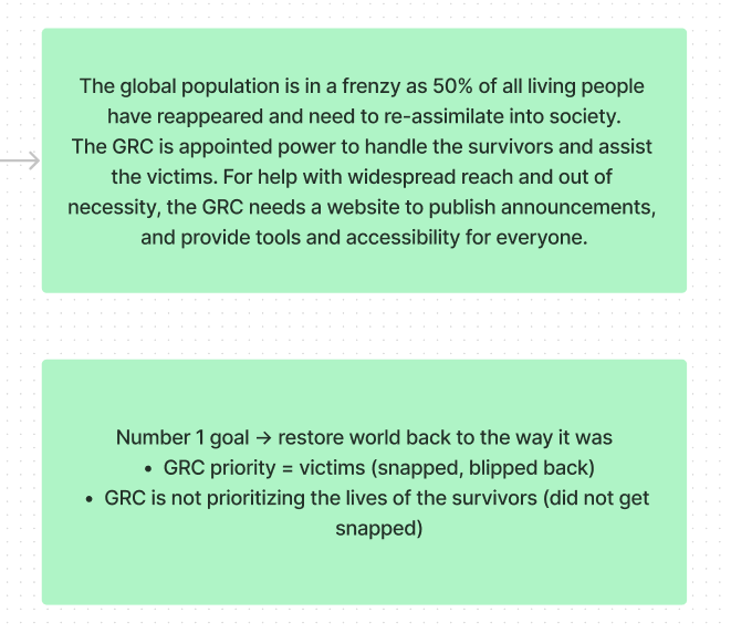
The Blip led many survivors to relocate to new countries and occupy previously-owned property, jobs, and assets, as these nations required more workers to sustain societies. The audience can infer the extent of social change required to accomplish this. With the return of the "blipped" victims, the GRC believes that the only path forward is to return the world back to how it was before The Blip: by deporting all who had relocated, and restoring all properties, jobs and assets to their original owners. This became a point of contention in the show, especially when blipped victims struggle to reintegrate back into society and resources are taken away from survivors, many of whom are now refugees.
Years after the show had ended, I was watching a YouTube video discussing the effectiveness of the GRC, which made me think about how the GRC would have advertised their plan and how they might have been perceived by the general public if such a global disaster happened in real life. This led me to reflect on how global corporations were perceived during the COVID-19 pandemic, which reminded how much we relied on the Internet for aid, services and information access. Eventually, I pondered about what a website for the GRC might look like.
By the end of the project, I developed a 6-page static website for the fictional organization tasked with restoring global stability.
- Designed the information architecture for a global disaster response
- Customized and tailored a design system
- Content management and visual hierarchy aligned with the Web Content Accessibility Guidelines (WCAG)
I do not own any aspect of Marvel, and no copyright or trademark infringement is intended. All rights go to the Marvel, Marvel Comics, Marvel Studios, and the Walt Disney Company.
🏆 Goals
My goal was to create a comprehensive self-directed project that involved both UX design and front-end programming. I chose to "represent" the GRC in this project, as if I am a developer hired by the GRC, to gain more experience in understanding and exploring the motives and goals of employers and stakeholders. If I align our real-life setting and time with when TFATWS took place, the GRC would likely be very eager to launch an website as quickly as possible.
My motivations were to learn more about how it means to have empathy for your users, and gain more experience in applying user journeys to better the overall user experience. As well, this project served as a good opportunity to refresh my skills in web development.
⏳ Development
Thankfully, gathering information from a blockbuster media franchise was not a difficult challenge.
The GRC made a few minor appearances following TFATWS, but I did not remember when, where and at what timecode. Fortunately, the MCU has a large fanbase and community-driven sites like the Marvel Cinematic Universe Wiki contained all the information I needed. This included, but was not limited to, precise infomation like specific episodes, calendar dates in the MCU timeline, plot summaries, character names, and relevant screenshots and graphics from the films and shows.
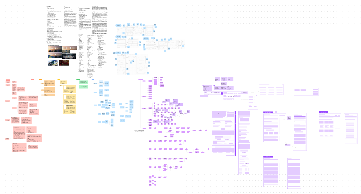
Figma's FigJam feature served as a great tool for brainstorming. Feel free to browse around my FigJam file with the embedded Figma component above!
From the Marvel Wiki site and popular forums, I gathered every significant and relevant information I could find, particularly regarding important story beats in TFATWS and the motivations of the different parties involved. This also helped me identify three categories of important users that the GRC website would cater towards:
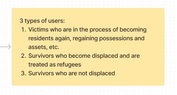
- Blipped Victim - vanished during The Blip and to reintegrate back into society
- Displaced Survivor - survived during The Blip but are now being displaced by the GRC (i.e. about to be sent back to their original residences)
- Non-Displaced Survivor - seeking information
From the perspective of the GRC, I labeled the half of the population that disappeared during The Blip as blipped victims. Since the GRC was favouring them over the survivors, this label felt most appropriate.
I labeled the half of the population that survived The Blip as displaced survivors. To address the unbalanced treatment between them and the blipped victims, I chose this label, which I believed was neutral or innocuous enough and accurately reflected their situation.
Naturally, there existed survivors who remained in the same location and therefore were not directly impacted by the GRC. However, they would still want to stay informed for themselves or to help someone they know.
I had no prior experience designing government-affiliated projects. In addition, I had limited knowledge on what typically existed on government-ran or global corporation websites. This included all aspects of what my goals were. To address this, I sought inspiration by researching well-designed government websites that covered all relevant and necessary functions.
Many of my search results highlighted the United States White House website as an example of effective UX design, so I made it my central source of inspiration. As a supplement, I also reviewed the websites of the Government of Canada, Ontario, and Toronto due to their familiarity. By sketching out major layout designs from various pages of these four websites, I gained a better understanding of common layout patterns and the placement and quantity of information.
With more knowledge, I began the design planning for the GRC, to which I named the process: the Workflow Stages.
Stage 1 - I consolidated a list of MCU facts that were most relevant to my project from the aforementioned fan-ran site and various forums. This helped me clearly understand the motivations and intentions of both the GRC and the three identified types of users. As a result, I was able to better visualize why the GRC might not achieve longterm success with their current plan of action, which allowed me to identify their strengths and weaknesses.
Stage 2 - I solidified three core details that became the focal points of my project, as well as what I would have presented to real stakeholders:
- What is the problem?
- Who are the types of users?
- What are the goals?
Stage 3 - It was also important to empathize with the three types of users I had identified to ensure a user-centered approach. I developed a user persona for each of the three types of users:
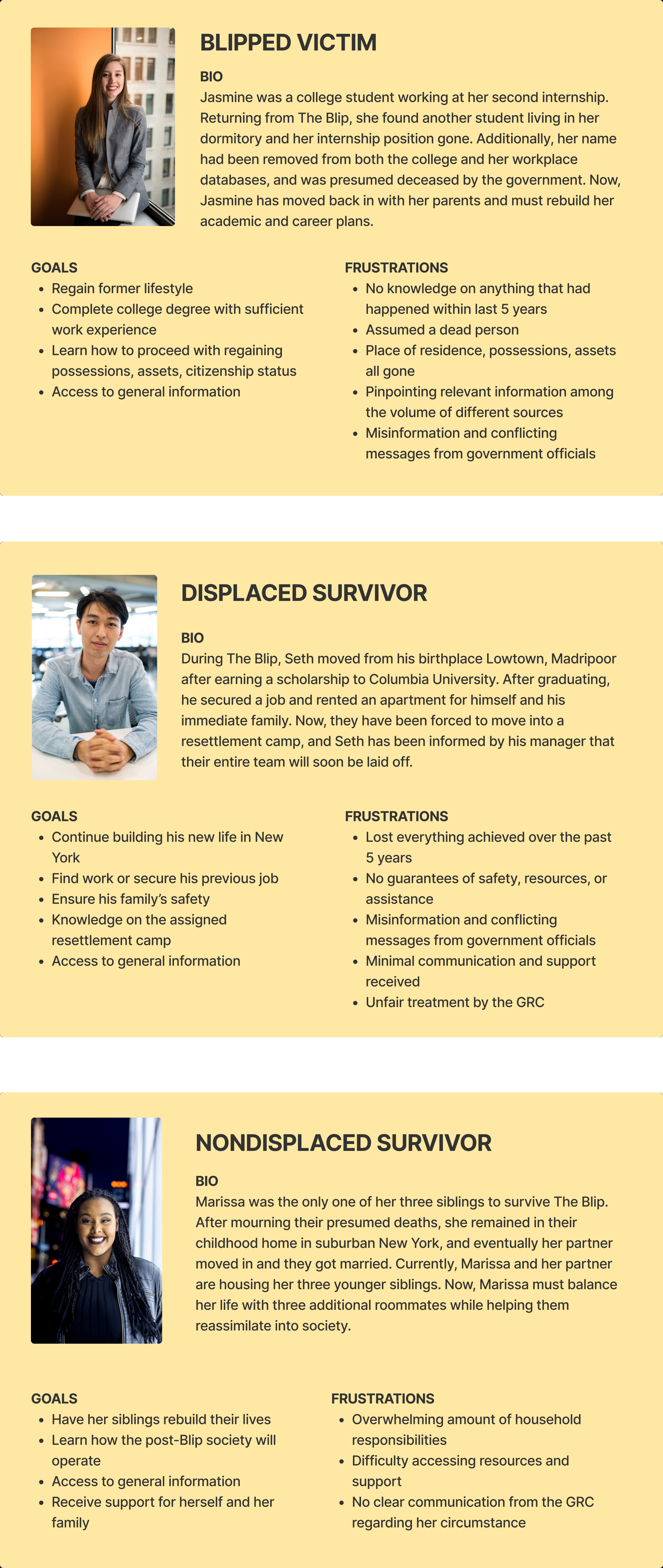
- Blipped victim: Jasmine, a hardworking college student, feels that society moved on in the blink of an eye without her
- Displaced survivor: Seth, a recent graduate and immigrant, feels he is losing his sense of identity
- Non-displaced survivor: Marissa, though not directly impacted by the GRC, struggles to balance her personal needs with growing family obligations
Stage 4 - I crafted my problem statement:
Stage 5 - I brainstormed the ideation of my website. This was comprised of listing the design fundamentals present in successful sites, my goals for the website to be optimal or successful, and site features I wanted to include.
Initially, I envisioned the GRC functioning as an all-in-one hub, such that the GRC housed all processes that the users would need to apply for. For example, blipped victims applying for financial help or to regain their citizenship status. However, this idea became impractical since different regions have different financial and legal systems, with different sets of processes, etc. Therefore, the primary goal of the site shifted to information access.
Additionally in TFATWS, the GRC was shown to deploy security measures or armed forces to a location when required. Logically, I thought that GRC would offer a list of services that users could request. More information regarding this in 📑 ideation.
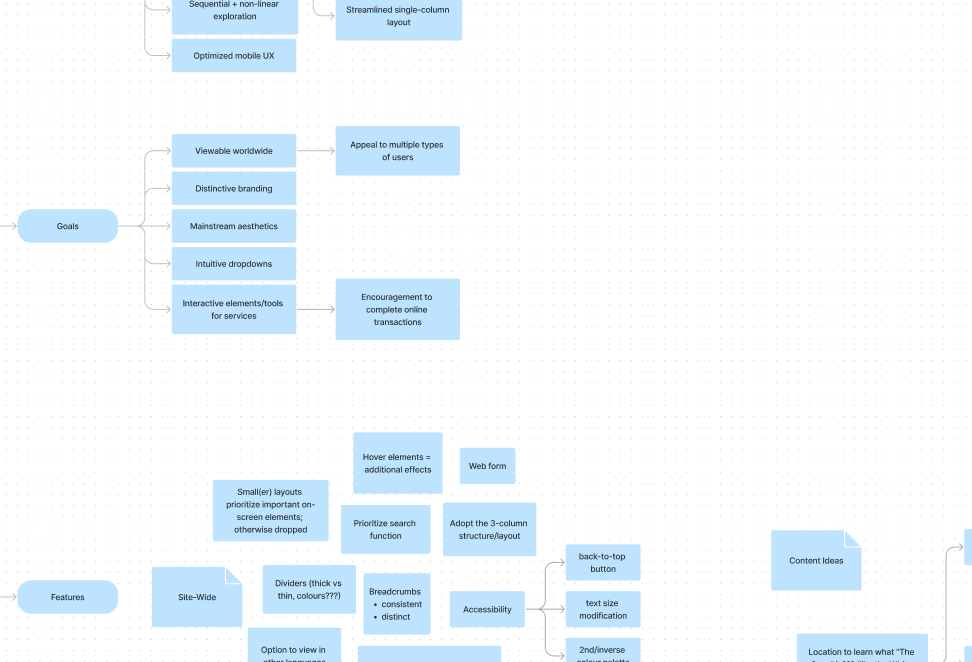
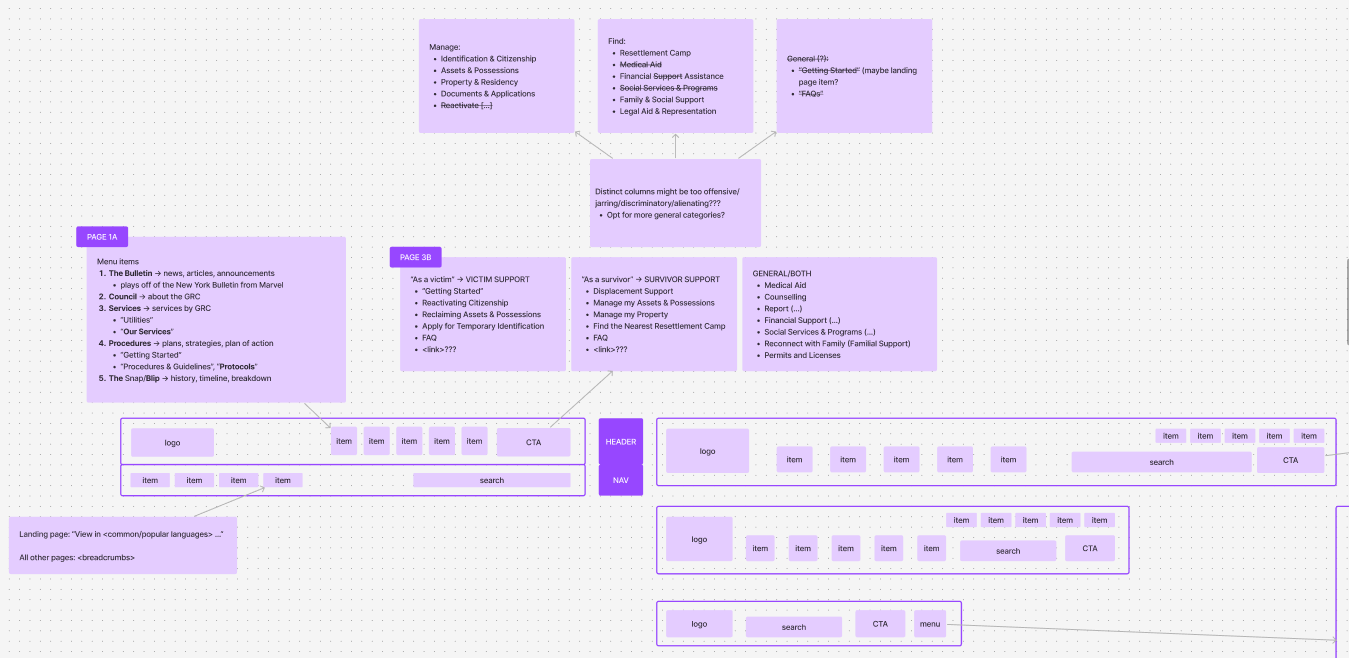
Stage 6 - Finally, I moved on to building the information architecture, where I spent a lot of time narrowing down and perfecting the structure. Consider interacting with the FigJam module!
First, I clearly identified the user goals. There would be a priority in information access, as well as how users may interact with the page(s).
Second, I identified how users would arrive at any given page: either from the home page, previous navigation, a shared link, or a search engine result.
Third, I used purple text boxes in FigJam to map out the task flow, which built upon the aforementioned user goals. With a smaller text size and a lighter shade of purple, I annotated each branch with additional ideas, critiques, comments, or questions. Then, I reviewed those and bolded the points that offered effective solutions to any questions raised.
Last, I mapped out the user flow for each user goal identified, using specific shaped text boxes:
- Circle: start/end point
- Rectangle: user steps, viewable pages
- Diamond: conditional/decision point
- Parallelogram: actions, inputs, outputs
After completing my workflow stages, I opened a new Figma file to begin working on the design system!
Using screenshots I collected from the MCU Wiki and help from an image-based font identifier site, I was able to identify the font of the text used in the GRC logo as Adobe Garamond Pro (AGP). I decided to utilize this font family as my primary typeface and obtained it through my Adobe account. I also utilized TypeScale to help structure my typography.
As I worked with AGP, I realized that the font family was not as robust and easily accessible as other free and open source families. I decided to continue using AGP for large text elements (i.e. heading text, large display texts). Otherwise, I decided on using the IBM Plex Serif font for all other text elements (i.e. body text, interactive elements, footer text).
I based my colour palette on the aforementioned screenshots. With the amount of blues used, and the psychology behind the colour, it was logical to adopt blue as the brand colour. I colour-picked around for a shade I liked, and adjusted the HSL levels to identify a dark shade to use as the primary text colour. As well, I wanted to pursue a minimalistic theme, and so, a neutral white colour as the background would be optimal. This allowed me to solidify the colour rule I wanted to follow:
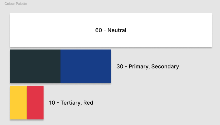
- 60% of the page = neutral background colour
- 30% of the page = primary and secondary colours = text colour + brand colour
- 10% of the page = tertiary and accent colours
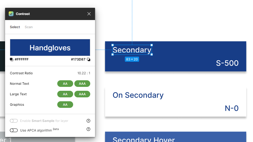
With my focus on accessibility, I generated a tonal palette for each colour using the Foundation: Color Generator Figma plugin by Jorge Fernandes.
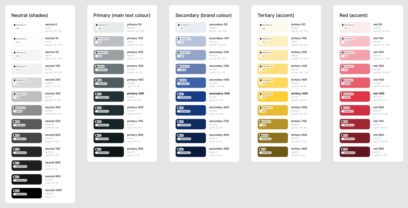
- 13 shades of neutral colours (black and white)
- 10 shades of the primary colour
- 10 shades of the secondary colour
- 10 shades of the yellow accent colour
- 10 shades of the red accent colour
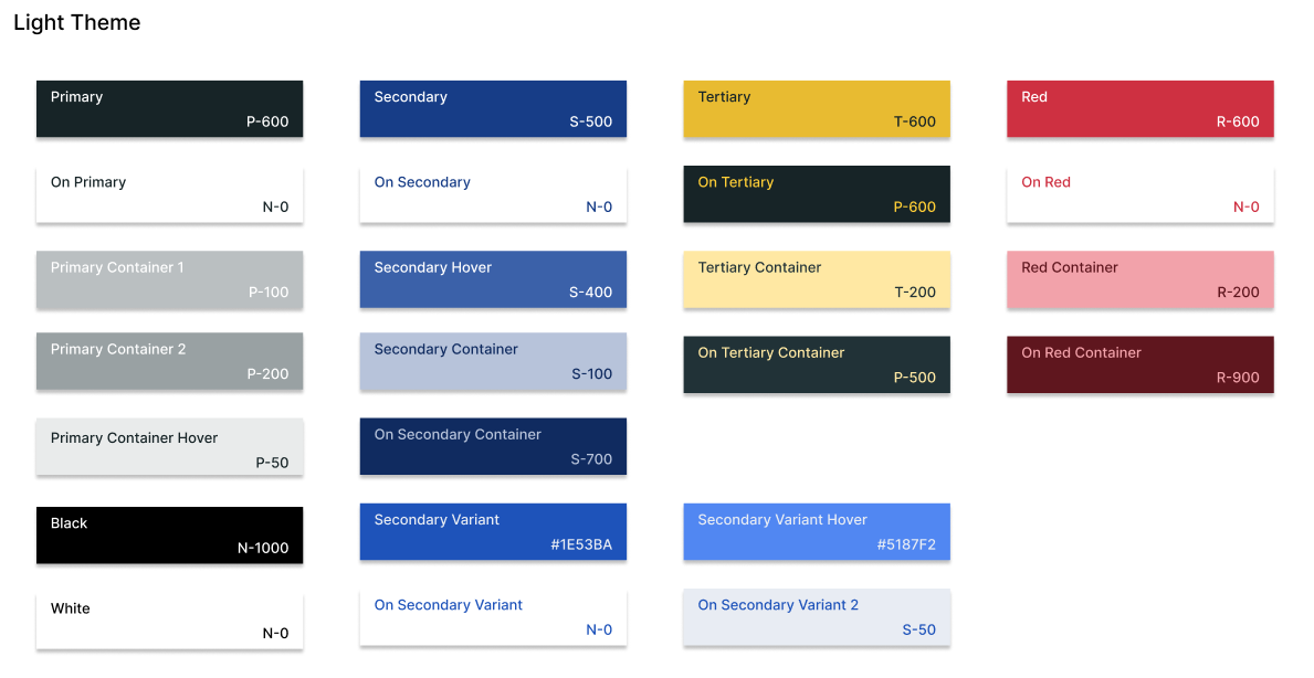
Then, I built my full color palette and labeled it as the Light theme. The layout and labels were inspired by the Color Guidance by Material Design. The Contrast plugin by WillowTree was incredibly useful in selecting approrpiate shades and tones.
📈 Early Ideation
I migrated simple pencil sketches onto FigJam and roughly built the layouts using different shapes.
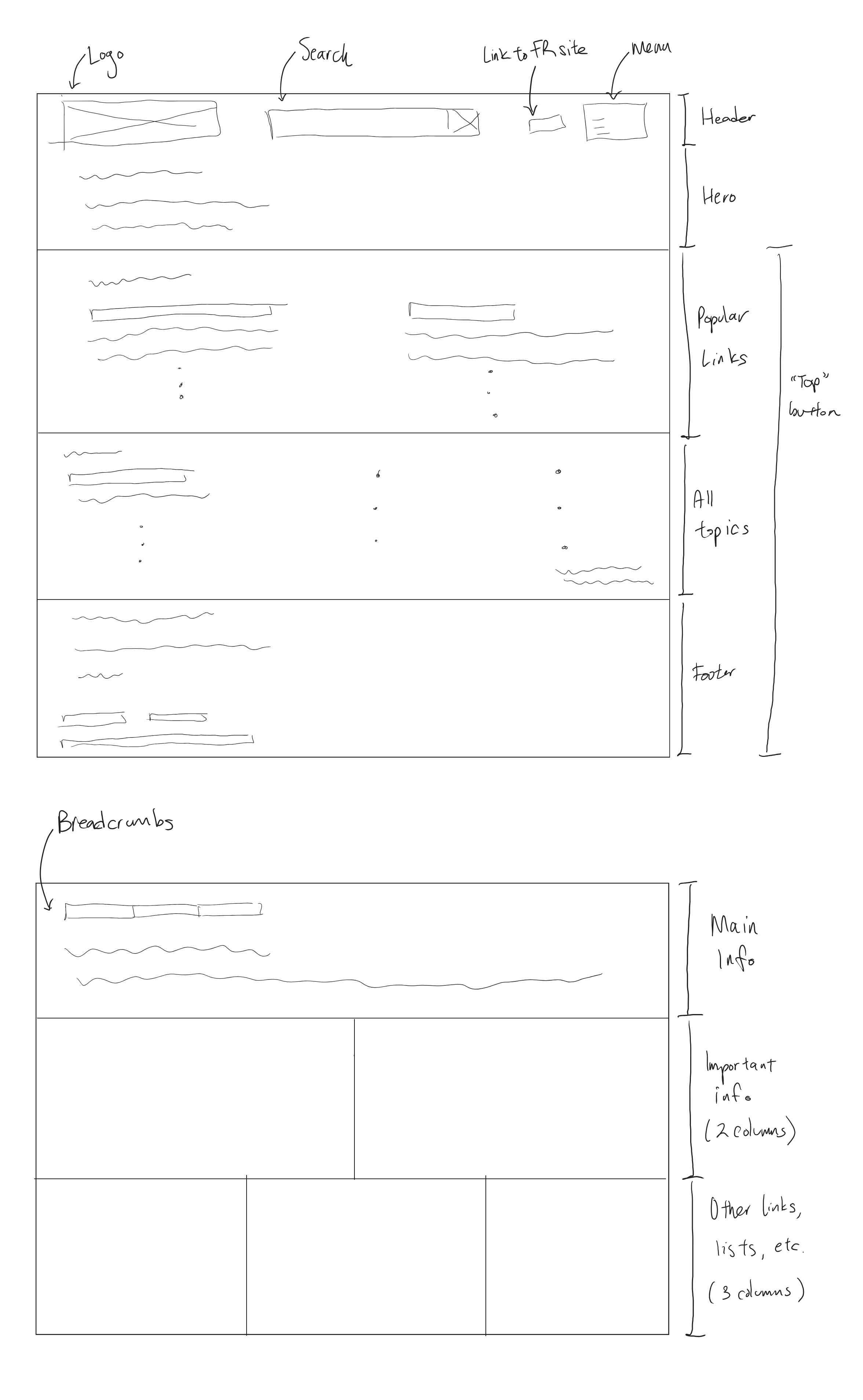
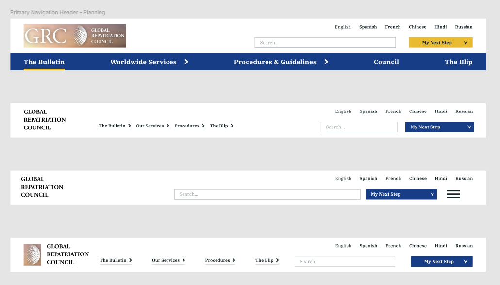
When designing the main navigation header (located at the top of every page), I aimed to incorporate as much navigation functionality as feasible. As the GRC is a global corporation, users should be able to conveiniently view pages in their preferred language. The offerred languages section is placed separately from the primary navigation. This primary navigation contains a few menu items and a call-to-action (CTA). This CTA button, labeled My next step, serves as an interactive element that allows the user to quickly identify their next course of action. When clicked, it opens a modal that displays three columns of links, each with its own heading.
Inspired by the United Nations website, I decided to include a small list of the most common languages in a small section away from the primary navigation.
On larger screens, the primary navigation on the header contains all five links. This number was determined after my brainstorming process:
- Brainstormed a list of relevant menu options applicable to any type of user visiting a GRC web page
- Categorized the list into different groups based on hierarchy and similarity [via the card sorting method]
- Drafted an information architecture
- Rearranged items after further testing
On smaller screens, users need to utilize the menu to interact with the primary navigation.
The menu icon is visible and accessible to open on all screen sizes that cannot display all five menu links. The layout and design of the menu were directly inspired by the U.S. Web Design System. More information regarding this in 📑 project testing.
For the My next step modal, the design and layout was inspired by the City of Toronto website. On their navigation header, they have a CTA with the text I want to..., which opens a modal with 5 curated columns of links.
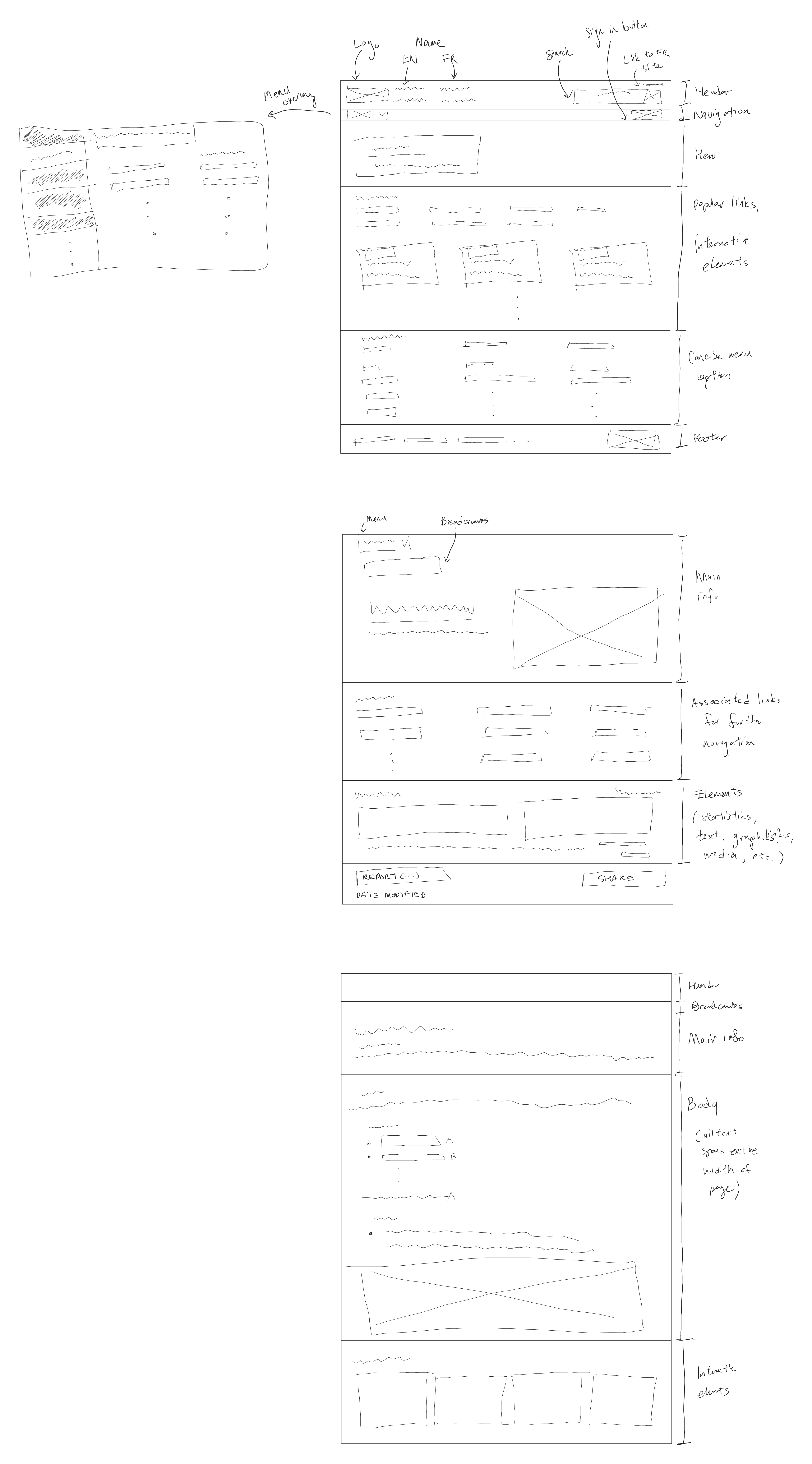
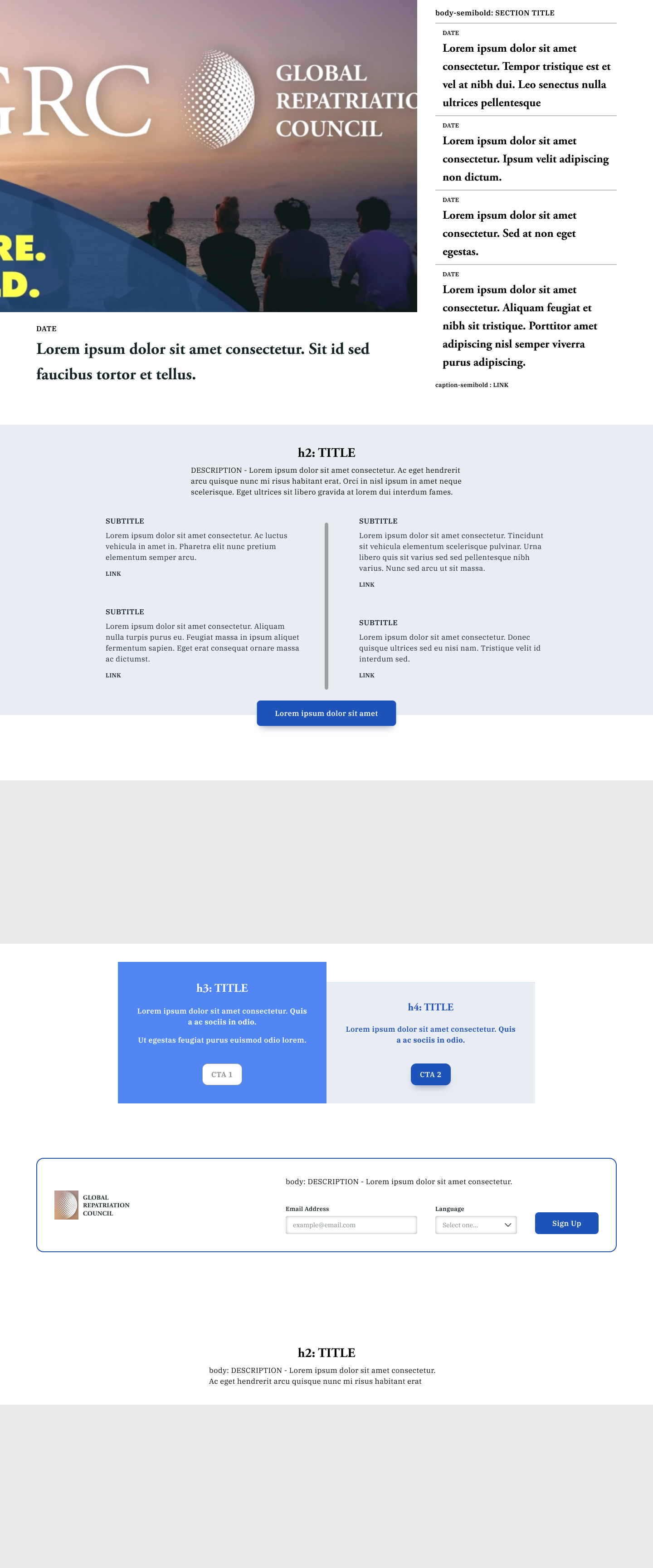
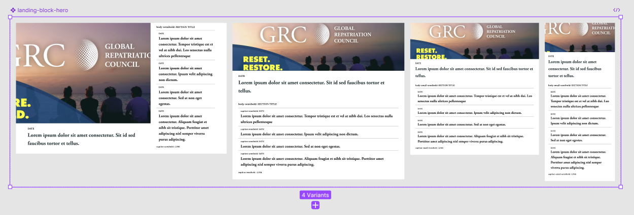
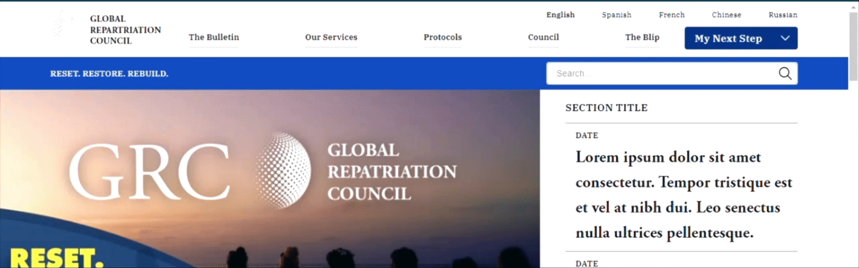
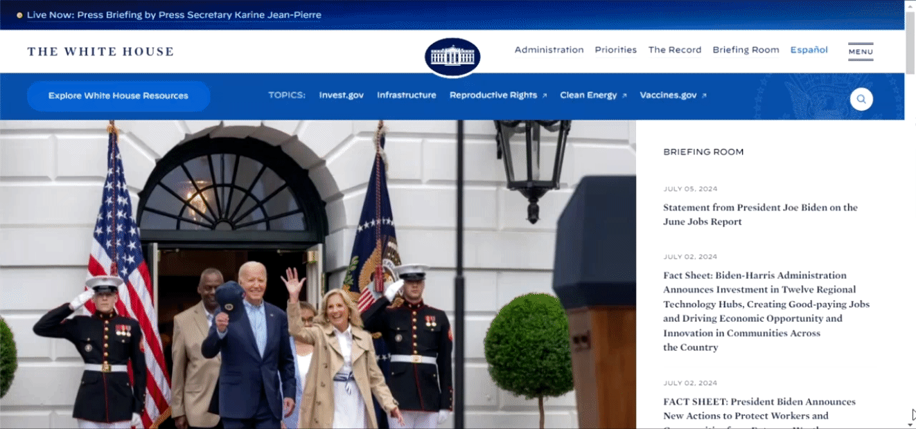
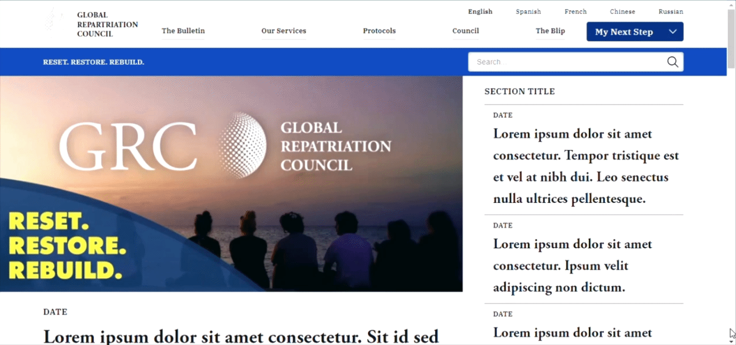
I took inspiration from the White House website's landing or home page design for the GRC home page. I divided the design of the GRC home page into five sections:
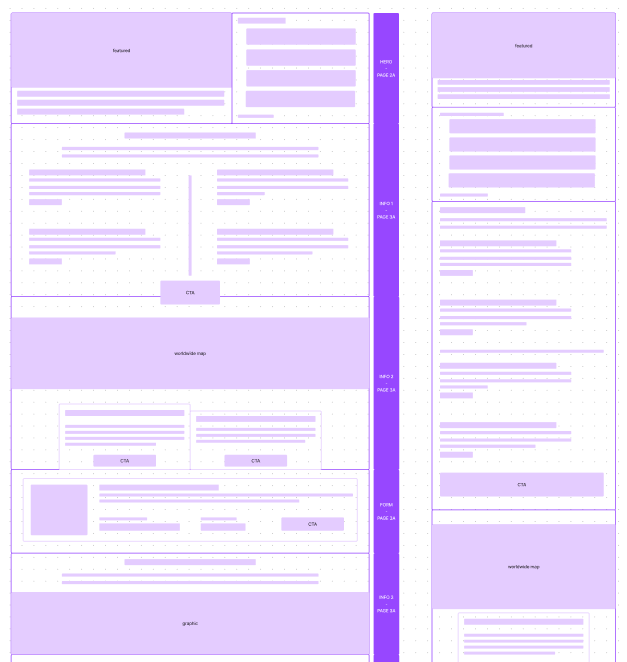
- Left: Layout for large devices
- Right: Layout for smaller devices
- Hero - serves as the main viewable item of content, contains two subsections:
- Major: displays the most recent GRC news announcement or article published onto The Bulletin
- Minor: lists a few recent news articles aside from the one featured in major
- Information 1 - hints at the user's circumstance (i.e blipped victim or displaced survivor) and provides a corresponding link to a general help page
- Information 2 - features a worldwide map and two relevant CTAs
- Form - communications form to receive information from the GRC
- General graphic - displays a graphic with a generic title and supporting text
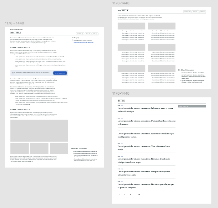
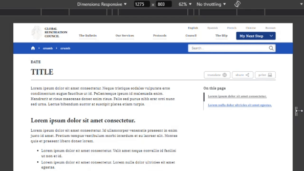
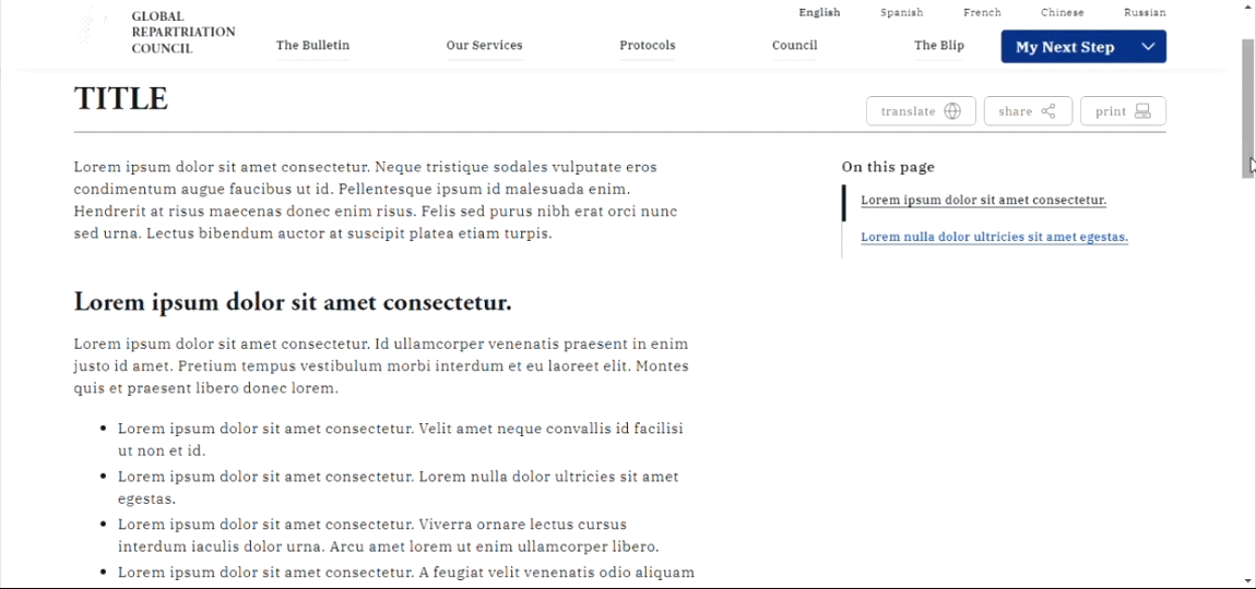
The layout for all other common pages was inspired by the City of Toronto website. On larger screens, the navigation column is placed to the right of the current page's main content. On smaller screens, this navigation shifts below the main content. The navigation includes an in-page navigation element, and links under a Related Information element, both when applicable. All pages will have the main site navigation header and a footer.
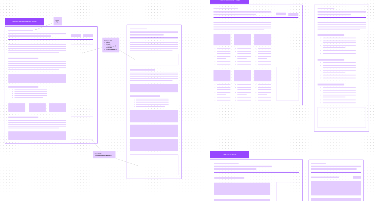
There are three additional types of pages besides the home page. On the previous image:
- Left: Individual/informative - template for pages containing information like articles, general information, etc.
- Top right: Menu overview of its options - showcasing the site's entire information architecture, including the primary navigation
- Bottom right: The Bulletin
Inspired by the White House's Briefing Room page, I wanted the GRC to have its own dedicated page containing the list of any published announcements or articles directly from the GRC. I decided on the name "The Bulletin" which references the Marvel in-universe New York-based newspaper of the same name. The Bulletin page contains a pagination at the bottom, and a filter/sort interactive element near the top, which affects the display of the list of published news/articles.
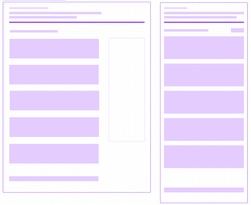
Right: Layout for smaller devices
The structure of the responsive layouts was determined using different grid layouts in Figma.
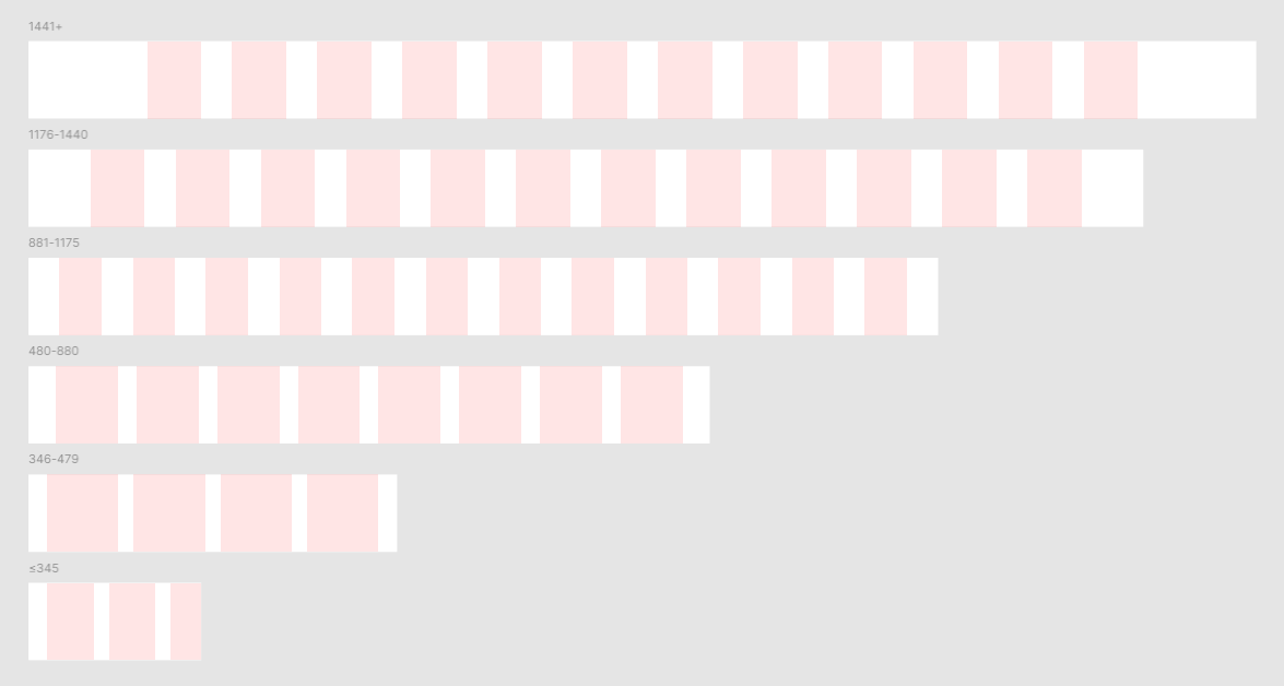
The breakpoint values (in pixels) are 346, 480, 881 and 1176. Device widths up to and including 880px (ranging from mobile phones to medium-sized tablets) will have a smaller typography that corresponds to smaller devices. Device widths starting at 881px (ranging from larger tablets to desktops) will have a larger typography that corresponds to larger devices.
For device width (in pixels):
- 1441+
- Column count: 12
- Type: Center
- Width: 70
- Gutter: 40
- 1176-1440
- Column count: 12
- Type: Stretch
- Margin: 80
- Gutter: 40
- 881-1175
- Column count: 12
- Type: Stretch
- Margin: 40
- Gutter: 40
- 480-880
- Column count: 8
- Type: Stretch
- Margin: 35
- Gutter: 24
- 346-479
- Column count: 4
- Type: Stretch
- Margin: 24
- Gutter: 20
- ≤345
- Column count: 4
- Type: Left
- Width: 60
- Offset: 24
- Gutter: 20
Next, I moved on to building high fidelity prototypes. Going forward, each element (e.g. text, subtitle, label, icon, etc.) was contained in their respective groups (also known as frames in Figma), with size constraints set according to the appropriate grid layout. This ensured that each prototype was responsive to the device size. I began by designing for the 1176-1440px frames (designs on larger screen sizes) and then proceeded to design and build the other frames in descending size order.
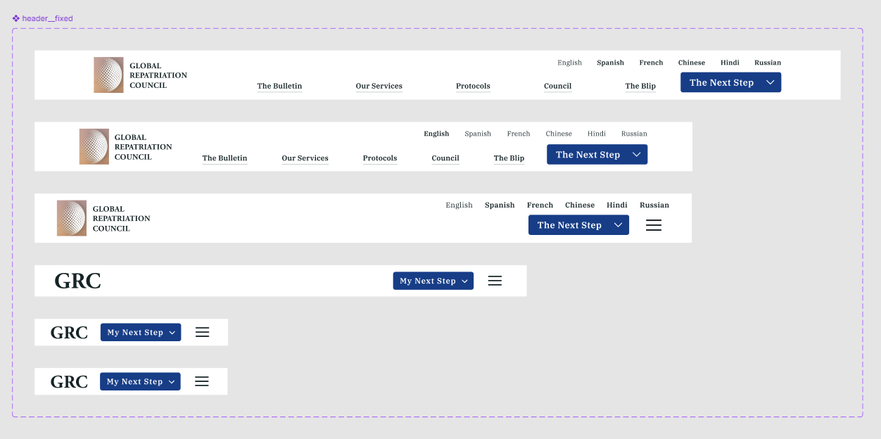
First, I built the main navigation header. I was able to test and adjusted the text values and the size of the CTA accordingly.
I remembered that I had a copy of the Octicons - Github's icon set design file on Figma, so I used their icon set as a temporary placeholder. With this, I planned and built a variety of components and variants.
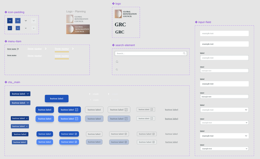
- Icon padding (for buttons)
- Menu item (on the navigation header)
- All CTA buttons (primary, secondary, tertiary, and different states)
- Logos (of 3 sizes)
- Search components (of 3 sizes)
- Variety of input fields
I gradually built a high-fidelity prototype of the home page first:
Even the high-fidelity prototypes went through multiple iterations to achieve the "highest" level of fidelity. I was adjusting sizes, constraints and colours throughout this process, which helped me learn and gain more experience in recognizing various structures and components of a website.
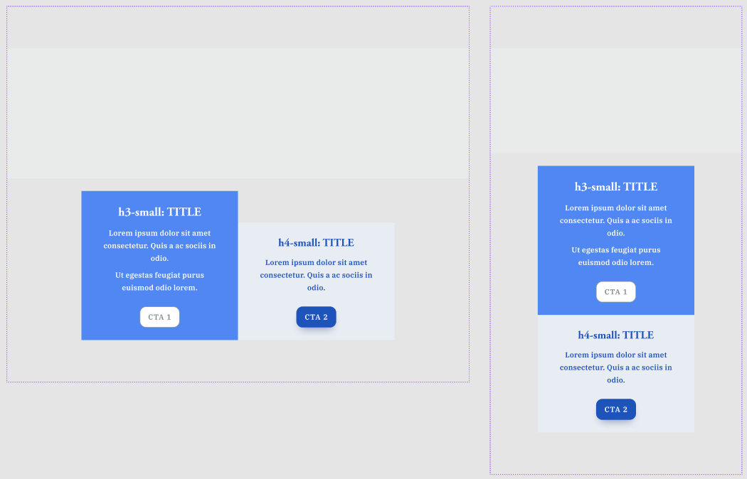
For example, on the landing/home page, the major portion of the hero section was constrained to take up at most around 2/3 of the entire allotted width on larger device sizes. On smaller devices, both major and minor will stretch to fill the entire allotted width:
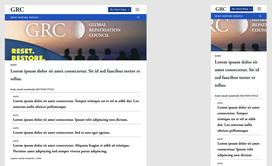
All long lines of on-screen text (e.g. text inside <p>) were constrained to prevent them from running too long on one line. The constraint was calculated based on the optimal line line length for web text, which is often between 40-80 characters. This is to maximize readability for users.
Information 1 is the section that briefly hints the user as to their circumstance (i.e blipped victim or displaced survivor) and includes a corresponding link to a general help page:
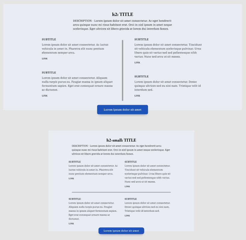
Information 2 contains a worldwide map (currently, a giant grey rectangle) and two relevant CTAs. Initially, I did not know what an organization like the GRC would include besides its main hero section, so I again took inspiration from the White House site. They employ a similar layout of the two rectangular sections, each containing some text and a relevant CTA. More specifically, the first contains interactive elements for contacting the White House by mobile or a general Contact Us button. The second includes small links under the heading Get Involved.
For the GRC, I adapted the design to introduce users to the global reach of the GRC. The map graphic may indicate exact locations of their office buildings and/or headquarters should they realistically have them. The two CTAs can direct users to learn about specific regional efforts, with the link functioning like a store locator on e-commerce sites, and to discover how the GRC has representatives worldwide, with the link leading to the Council page.
The section title, section description, four headings and section CTA of Information 1, as well as the map image and the two CTAs of Information 2 will be updated with real content in 📑 final designs.
Then, I built the general layout/template for all other types of pages:
Top right: menu overview of its options
Bottom right: The Bulletin
In addition, I built the components for the general communications form and the footer in all frame sizes:
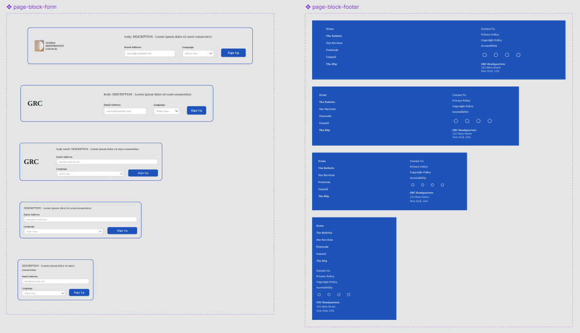
I took inspiration from the White House's footer design. The primary navigation located on the left side includes all the main menu links from the main site header. The secondary navigation located on the right side contains common important links like Contact Us and Privacy Policy, along with four social media icons (currently, placeholder circle icons).
🔬 Testing
The best type of testing is to actually get your hands dirty.
I used Figma's prototyping features to add connections and transitions from one frame to another. Although I was able to demo and play around with different types of devices directly in Figma, I felt too restricted within Figma. I thought that building my own webpage demo would be far better to my likings, so I launched Visual Studio Code (VSC), my code editor application, and migrated all pages into individual HTML files.
While refreshing my CSS knowledge, I was introduced to Syntactically Awesome Style Sheets (SASS), a popular and powerful CSS preprocessor. It made plain CSS coding more efficient and intuitive, so I decided to try it out for this project.
Afterward, I had built my own HTML/CSS demo, which provided more clarity in testing both technical and visual aspects. By utilizing the Inspect tool in my web browser, I adjusted some of the layout spacings and font properties of my typography. Consequently, I was able to establish a rule for such spacings and incorporated it into my design system.
Then, I built the rest of the important pages in Figma, as well as in basic HTML/CSS using VSC. The two VSC extensions that helped me test my code were Live Sass Compiler by Glenn Marks and Live Server by Ritwick Dey. After some simple JavaScript coding with JQuery, I had successfully built a functional web demo.
My focus then shifted to UI and UX testing. Regarding the UI, I experiemented with the colours and assigned values to various components such as underlines, elevations, and shadows. I also tested all other font properties and identified the most appropriate spacing values. For example, on the main header, I reduced the top and bottom padding when the current page is being scrolled to free up more screen space. As well, the current language being viewed has a higher font weight compared to the rest of the offered languages to better distinguish which of the elements is considered active.
- if
scroll-y> 45 pixels, then change padding and enable downward shadow - otherwise, keep regular padding and disable downward shadow
One major change made was to have all long lines of on-screen text (e.g. text inside <p>) constrained to prevent them from running too long on one line. The constraint was calculated based on the optimal line line length for web text, which is often between 40-80 characters. This is to maximize readability for users, and allows for responsiveness.
I was greatly inspired by the White House's central column of text, which utlized this readability technique. On larger device screens, this column maintains its different constraints based on different breakpoints.
While further reviewing the White House website, I found the design system of several U.S.-based websites: U.S. Web Design System (USWDS). To wrap up the testing phase, I explored the components and specifications of their design system and compared them to mine. In Figma, I ended up tweaking the modal designs and incorporated their design of a sticky table of contents (commonly known as an in-page navigation):
⭐ Final Designs
After refining my own design system and building the necessary modal elements, I added the changes to my code and updated my demo site pages.
While working with the White House site as a reference, I was constantly learning from their front-end and back-end designs.
The White House's home page has a sticky-padding element that occurs when scrolling the main news spotlight on their home page:
I incorporated this into my own home page hero section.
Additionally, while using Inspect on my web browser, I noticed that the White House's HTML code frequently included Accessible Rich Internet Applications, also known as aria tags, which are attributes added HTML elements to improve accessibility. I decided to add them into my HTML code and, in the process, learned more about accessibility features and tools.
To strengthen the site and add more creative touches, I found ways to include a variety of relevant MCU details. For example, I added:
- Key MCU in-universe events and their dates onto a dedicated timeline section on the Protocols page
- A viewable list of countries with representatives on the council - similar to the United Nations Members States page
- An expanded view of those representatives - modeled after the ability to view individual members under the White House Administration page
- A dedicated information page regarding The Blip - also a menu item on the primary navigation
I utilized free SVG Font Awesome versions of a few icons, and the rest from Octicons. Finally, I replaced some of the placeholder Lorem ipsum text on the home page with real content:
- Hero - minor: section title and link located at the top and bottom respectively
- Information 1: title, description, four headings, and CTA
- Information 2
- Form: description
- General graphic
With all these changes, I finally completed my rendition of the GRC website. Check it out here!
List of all GRC pages:
- GRC Homepage
-
The Bulletin
- Generic information page (template)
-
Our Services
- Menu overview (template)
- Protocols
- Council
❓ What I Learned
I achieved my initial goals, but I believe those goals have evolved since their initial state. Yes, objectively, the overall goal was to complete this project. However, "completing" became less of a priority as I progressed. I found myself constantly discovering new ways to improve certain features or expand existing ideas into several others. As time progressed, I also struggled finding a point where I could call quits... Wasn't there always something that can be improved?
At a certain point, I realized that this mindset was holding me back. After suffering some burnout, I took a month away from this project. When I returned, I was able to examine this project with a refreshed mindset.
I reflected on how I did accomplish the goals I had set for myself in the beginning. As well, I was able to explore a multitude of ways to better user experience. With this new mindset, I finally felt ready to close this chapter.
And after cleaning up my Figma and coding files, I felt satisfied enough to publish this project.
💭 Next Steps
As I only used the basic (and bare minimum, really) HTML, CSS, JS coding conventions to build the prototype, advancements could include utilizing frameworks like Flask or Django. Additionally, I would need a better organization system for the web files (i.e. building a specific folder system... an information architecture, if you will).
Lastly, there are a few ways to better readability and accessibility. For example, the White House website offered a toggle for a high-contrast color palette, and the City of Toronto website offers a larger text size option. I believe that these would help me (or the GRC) better align with the Web Content Accessibility Guidelines.
Last modified: November 24, 2024