🚀 Intro
Rest and recovery are important aspects of fitness that can easily be overlooked. Physical activity may lead to short-term soreness, or, at worst, overexertion.
As of September 2024, Apple publicly released iOS 18, the newest update of Apple's operating system. Under iOS 18, the Apple Fitness application received a new design that includes a feature to pause rings for a specified amount of time. This project was made using the previous iOS 17 version of Apple Fitness on the iPhone and the watchOS 10 version on the Apple Watch. Check out Apple's iPhone User Guide for Fitness.
In 2020, I bought an Apple Watch to help start my fitness journey by using the Apple Fitness application on both my iPhone and Watch. I appreciated the psychological effects of completing goals as "closing" (or completing) rings, and the Watch proved to be a convenient device for tracking my activity.
It became increasingly difficult to track and plan rest days (i.e. the days without high-intensity activities). Whether I felt lethargic or fatigued, or had too busy of a schedule that day, rest days did not always follow an easily recognizable pattern (e.g. fall on the same day(s) in a week). In addition, Apple Fitness did not provide any screen, modal, or features specifically dedicated to rest and recovery. There is no option to log rest days in Fitness or to pause goals only for the current day. Currently, to maintain any streaks, you either have to manually change the goal(s) to a lower value or complete low-intensity workout(s). Otherwise, you proceed with incomplete rings for the day.
As Apple Fitness campaigns for the idea of "fitness for everyone", I strongly believe that incorporating basic information about rest is as important as strengthening the catalog of workouts.
🏆 Goals
My main goal was to successfully integrate a "rest day" feature into Apple Fitness. My secondary goals were to learn the UI of Apple applications and understand the iOS design system. This would ensure that any new feature aligns with Apple's design standards.
Overall, I chose to focus on accessibility. I wanted to ensure that I could identify how each type of user can benefit from features that promote both activity and rest. While I never prioritized maintaining streaks myself, I would be lying if I said that streaks were not visually appealing or psychologically satisfying.
⏳ Development
My initial source of inspiration was Oura's Rest Mode. However, their feature is very intricate, as Oura is primarily a health-focused service. Understanding that Apple Fitness is designed to be very accessible and have a low barrier of entry, I concluded that a "rest" feature for Fitness would need to be seamless and avoid disrupting the strong user journeys that Fitness already established. Additionally, the feature should communicate that taking a time off from high-intensity activities is as important as achieving fitness milestones.
Just as we do not work or study for seven days straight, the same principle applies to fitness: we need time to mentally and physically recharge. Information on the importance of rest is readily accessible, for example:
- Peloton: Here's What Really Happens to Your Body During a Recovery Day
- Triathlete: Your "No Days Off" Mentality is Dumb, Pointless, and Holding You Back
- Michigan State University: The importance of rest and recovery for athletes
- [Journal article] The Sleep and Recovery Practices of Athletes
But the question then became: would users want a rest feature?
For research, I examined the opinions of existing Apple Fitness users regarding their attitudes toward rest, their overall experience with the Fitness application, and what a "rest" feature might look like.
- Apple Watch and Fitness designed to help with motivation
- Everyday fitness support for average person, casual "lifestyle" customers
- Therefore, "rings" is just a simple concept
- Apple using rings to promote fitness standards should allow rest option [to promote rest]
- Should be prioritizing quality over quantity
- Current state of ring completion:
- Gamification, especially during intial use of Fitness
- Becomes habit
- Provides visual reminders of progress and metrics
- Sufficient motivation to keep going and to keep tracking
- Start, maintain streaks
- Sharable
- Did Apple intend for gamification to take over Fitness?
- Current state of rest days:
- Become active recovery days
- Low-intensity activities
- Meditation
- Increase in inconvenience, hassle
- Lower or ignore goals [but should not have to "lower" goals since not accurate depiction of fitness journey]
- Abandon streaks all together
- Disable or ignore notifications temporarily
- Lead to losing motivation
- Not affected by gamification and psychological stimuli
- Does not care about incomplete rings
- Does not prioritize streaks
- Does not give much regard to rings overall
- Become active recovery days
- Use third party applications to track/maintain streaks
- Other services often have a variety of more concise metrics and options
- "Rest" feature in Fitness could be unbalanced:
- "Rings" do not appear to be intended for serious training - considers walking and serious exercise to be the same thing
- "Rings" more of a "minimal level" of something for very casual use - therefore, rest days not a necessity
- Adding "rest" could signal that Fitness/rings is part of serious training and scheduling
- Ultimately, closing rings is not of utmost urgency in the grand scheme of things
- Should not let rings dictate behaviour
- However, as aforementioned, Apple Watch and Fitness designed to aid with motivation
- Therefore, it is unproductive to continually disregard the significance of Fitness' core feature
In conclusion, there is merit in having a "rest" feature. A common type of critique usually relied on dismissive statements. For example, the idea that we should not worry about the completion of rings or that wearables should not dictate our lives. While these points seem obvious, they still offer an important perspective.
Clearly, no electronic or application should dictate our lives. However, this does not equate to neglecting the importance of the rings. Apple Fitness prominently features the rings, making them an integral component of its identity. Consequently, it is counterproductive to consistently overlook the significance of Fitness' core feature. Apple can afford to implement a rest and recovery component, and I believe that a successful rest feature could utilize and transform the concept of rings.
As Fitness endorses an everyday fitness service, an equally seamless rest feature should integrate smoothly within Fitness. There would be three types of users:
- Users who are engaged enough to find value in the feature
- Users who are indifferent
- Users who lack enough interest to find it valuable
Thus, a "rest" feature will do the following:
- Not interrupt flow
- Have easy transition to/from "rest mode"
- Remain an entirely optional feature
- Easily distinguishable
- Has lower priority than:
- "Change Goals" for move, activity and stand
- Achievements
- Viewing activity data/metrics
- Fitness+
- Sharing (with others)
- Has higher priority than:
- Application/account settings
- Change the units of measurement (e.g. metric to imperial)
Following that, I opened a new FigJam file to begin brainstorming the user experience for Fitness. I started by outlining four specifications. Also, feel free to browse around my FigJam file with the embedded Figma component!
- Static vs. dynamic components
- Static components, such as the "rest" button, would remain fixed on the activity screen
- Entering "rest" would trigger a state change, thus Fitness functionality would be dynamic
- Where is the best place to enable/disable the feature?
- Impact vs. ignore goals
- If "rest" impacted the goals, what would "rest goals" look like, and how would they differ from regular goals?
- Goals would theoretically be lowered, but by how much? Who determines these adjustments?
- If users are responsible, then what is the purpose of the "rest" feature? Would users ever set their goals to zero? How frequently would they adjust "rest goals"?
- If "rest goals" are calculated based on health metrics, how do we determine appropriate values? How relevant or useful is this for users? Would the majority of users care about this? Would we have to receive user consent to link to their health data? What if the health data is not up to date?
- If "rest" ignored the goals, how does this affect user experience? How would we effectively bypass goals without negatively impacting the application's core function?
- Should goals and requirements be relaxed, and if so, to what extent? Would the current day's metrics (i.e. calories, activity minutes, stand duration) continue to be tracked?
- What role do the rings play in this scenario?
- Notifications
- If notifications (e.g. stand reminders) remain active, what purpose do they serve during "rest"? Would maintaining the same notifications undermine the concept of rest?
- If notifications are silenced, would this better align with the rest feature? Should all reminders be turned off to encourage genuine recovery?
- Differentiating UI
- Need new UI elements and graphics to distinctly represent rest
- Alternative "rings" design? Different colour palette?
Given these considerations, a different UI and layout was necessary after users enable "rest". Enabling and disabling "rest" signified a change of state of the application. This required, at minimum, new icons and symbols, modifying the existing page designs to accommodate a "rest" button, and new layouts for the screens that follow after interacting with the button.
The "rest" feature should still allow users to track their activity, as they may choose to perform active recovery or still want to view their metrics for the day. The main purpose is to allow users the opportunity to pause the requirements of each activity goal. Overall, the feature should not rise to become a prominent focus of Fitness. Instead, it should integrate seamlessly with the rings and the central part of Fitness: tracking and viewing your activity metrics.
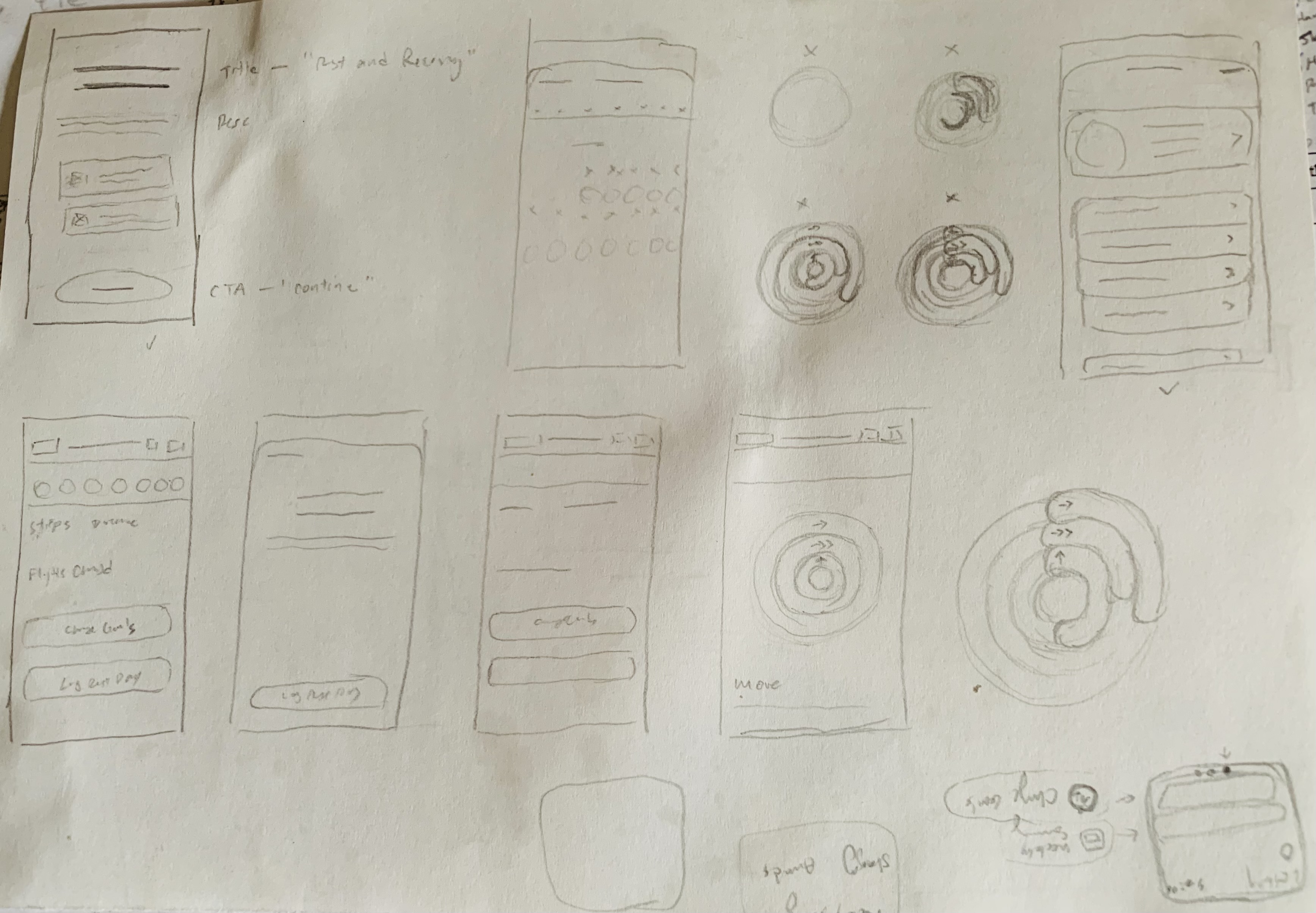
📈 Early Ideation
The early design processes involved:
- Sourcing Figma community design files of recreations of the Apple design system
- Mapping out user journeys
- Defining colour palettes, typography, spacings, layouts
- Introducing new icons
The project now officially uses the term Rest Day to denote the "rest" feature. Throughout your reading journey, I will include buttons to reveal some supplementary information. These only provide additional information and are not mandatory - but I highly recommend reading them!
The decision to adopt Rest Day over alternatives like Rest Mode was made after functional and user-centered considerations.
Rest Day emphasized the feature's intended use as a designed period of recovery. This aligns with the existing daily framework Fitness users are familiar with, where activity and goals are tracked on a day-by-day basis. It also effectively communicates that rest is an integral part of fitness as opposed to a temporary break or mode change. With the focus on day, it reinforces the idea of taking the full day to recover and recharge.
On the other hand, the term Rest Mode is already used by Oura Ring. Under Apple Fitness, Mode implied more of an informal transient state as opposed to being a significant part of the overall fitness routine.
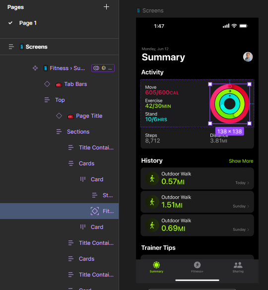
I used the Apple Fitness · iOS Figma design file by Kevin Lanceplaine as my starting point since it was an accurate recreation of the iOS 17 layout of Fitness' main page using the Apple design system. This main application page will be referenced as the Summary tab. In combination with the precisely named variants and frames, I was able to start creating and assigning colour variables within my own design file.
For additional references, I utilized Apple Fitness screenshots from Mobbin to gather screenshots of other screens such as onboarding and account settings. Leveraging these, I was able to make mockups of a new Rest Day UI.
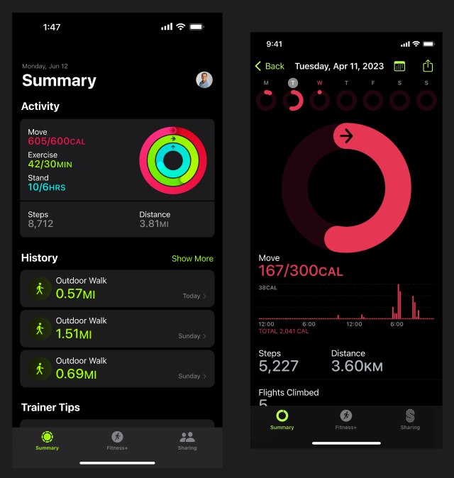
Right: Activity screen reached by tapping the Activity rings on the Summary tab, image source: Mobbin
Back on Figma, I built with Lanceplaine's frames to create different UIs for the Summary tab and Activity pages when Rest Day is enabled.
I recreated various components by building smaller elements (i.e. text, subtitle, label, icon, etc.) and constraining them within their own groups (also known as frames in Figma). They were size-constrained such that they aligned with the existing Fitness layouts.
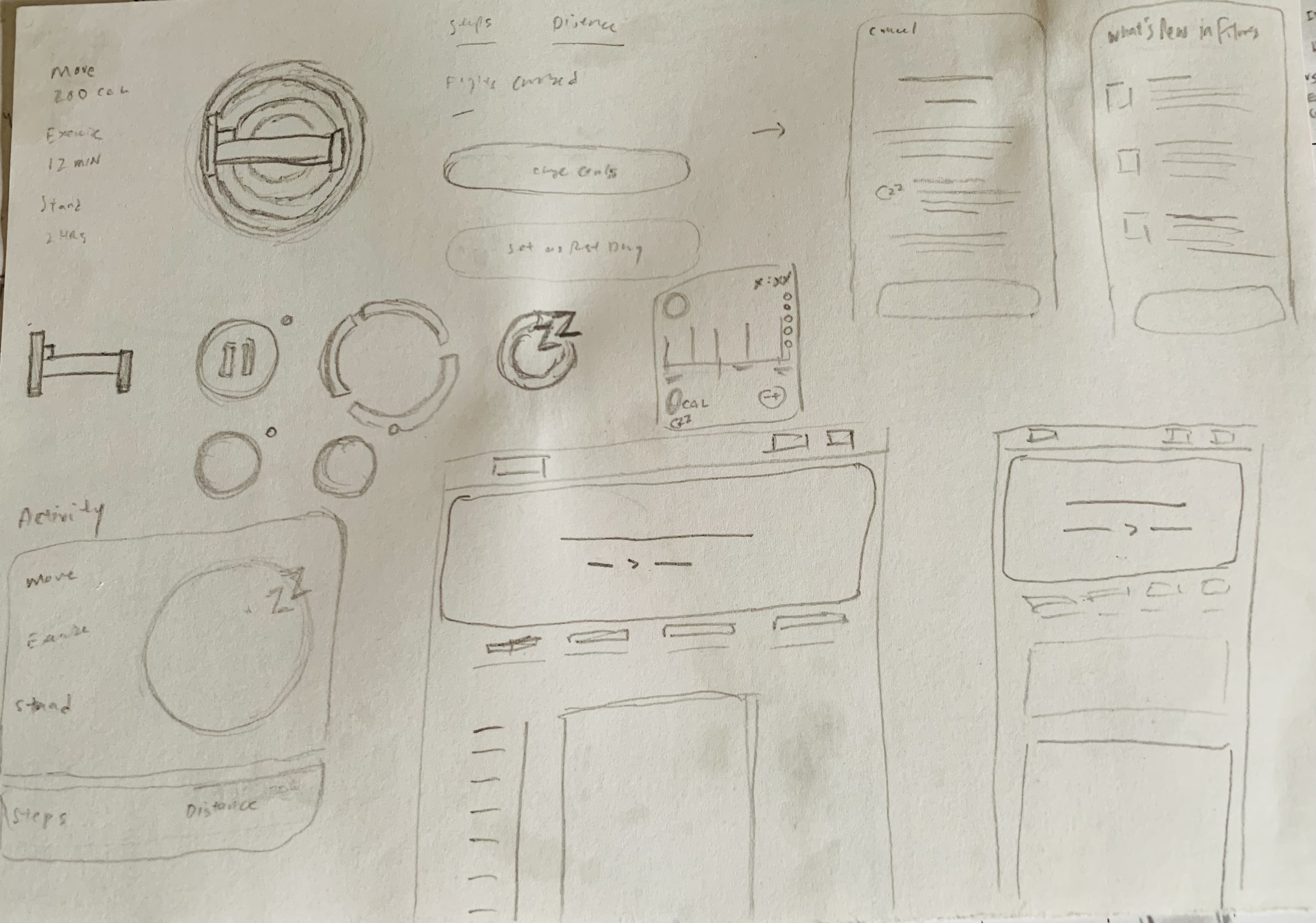
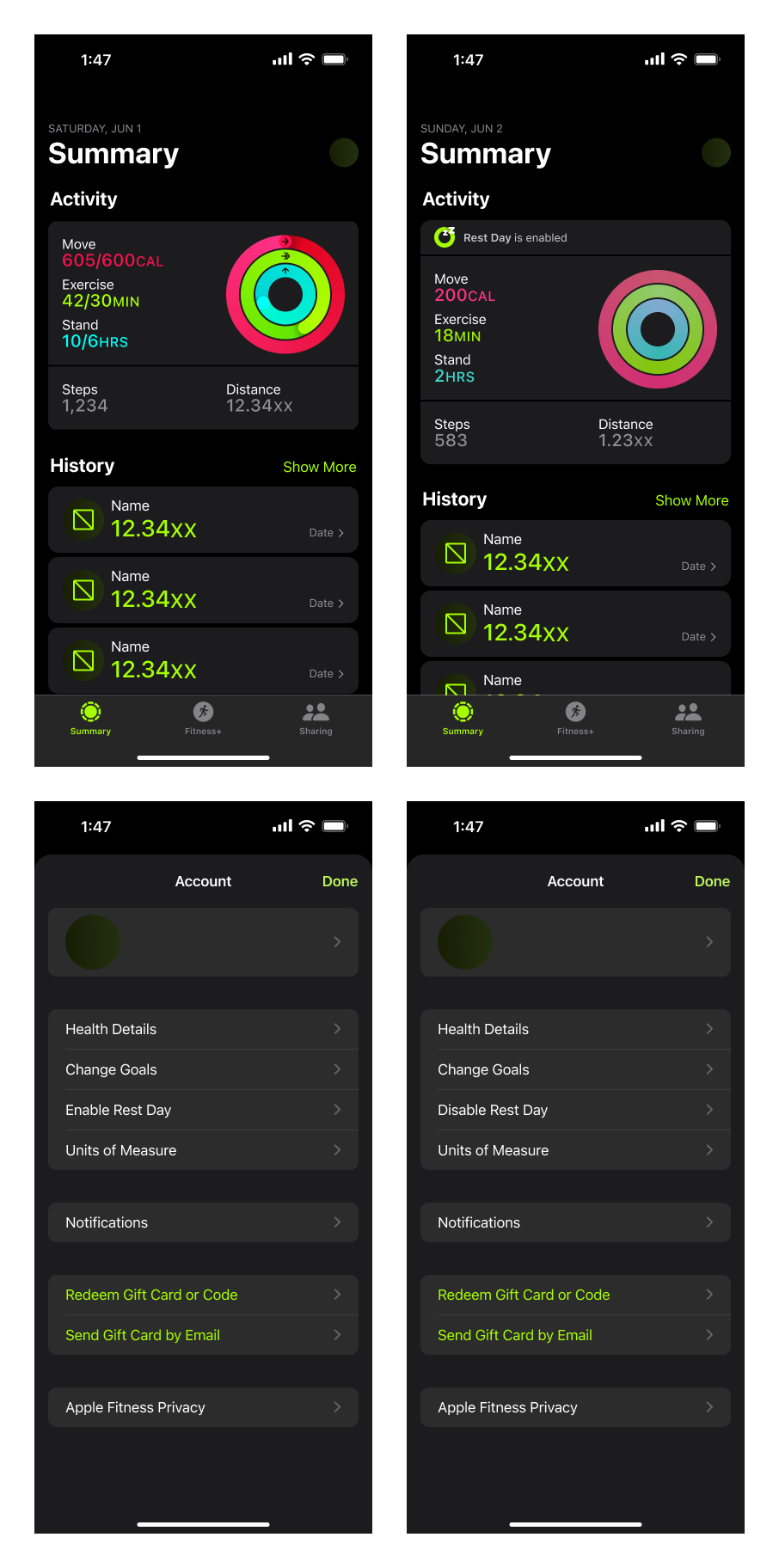
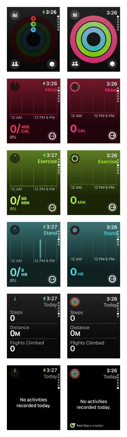
On the Summary tab, the rest version of the Activity displaying the current day's progress will hide the goal requirements from the three main fitness metrics. By removing the fractions, it decluttered the interface and reduced the emphasis of goal completion.
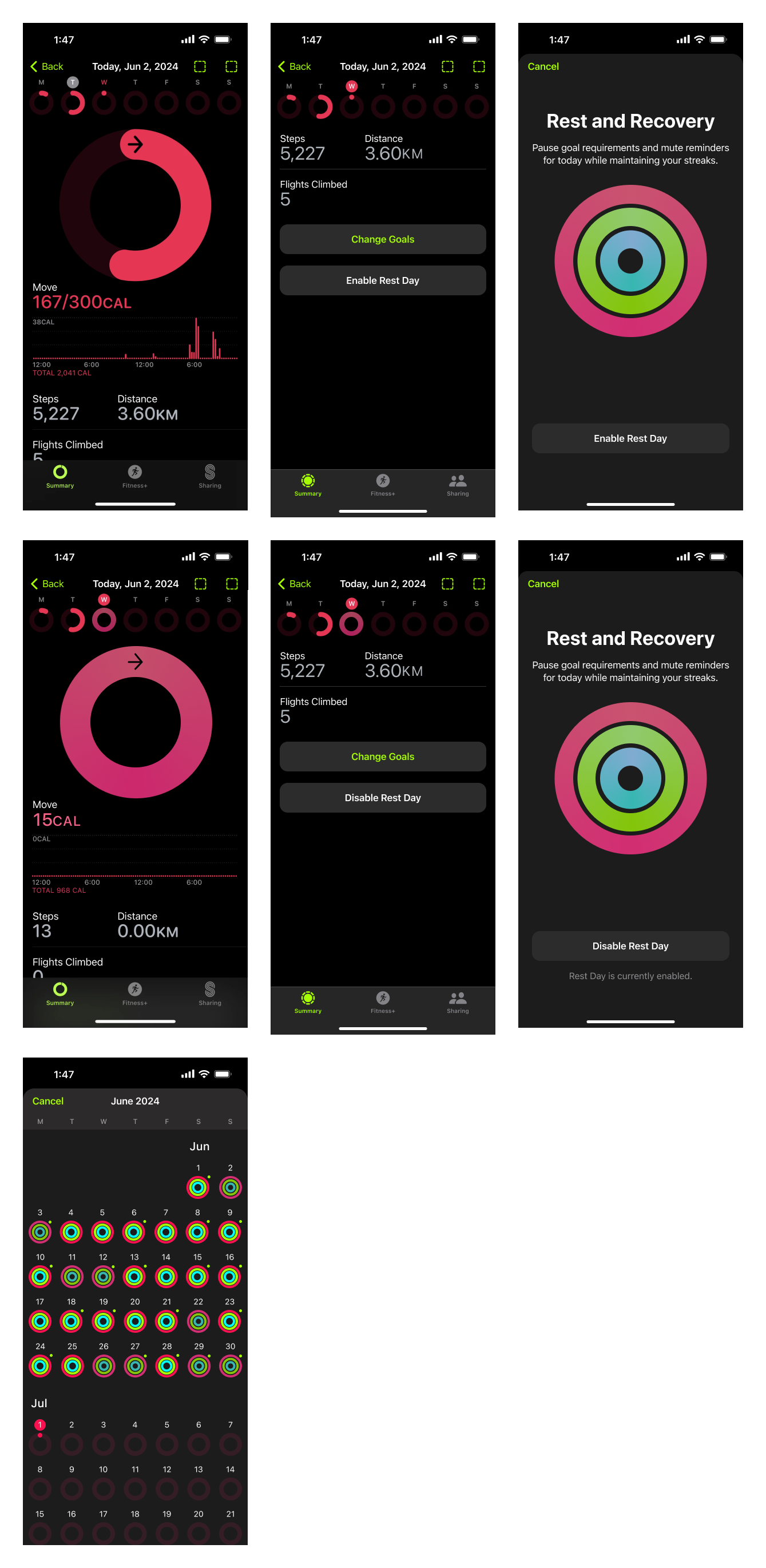
Additionally, I integrated a Rest Day button within the Activity page under the existing Change Goals button. The Summary tab will have a fixed indicator whenever Rest Day is enabled.
To further differentiate Rest Day, I incorporated a new:
- Unique icon/symbol
The new icon featured a symbol representing rest attached to the generic green Fitness ring. Initially, I compiled a list of relevant symbols, including a bed, moon, pause icon, and sleep/snore (zZ). I eliminated the bed and moon as options to avoid any association with the existing iOS Sleep Focus Status. Ultimately, I chose the sleep/snore symbol due to its compact size and because it better conveyed that rest in Fitness would not exclusively mean "pause all activities".
Left: Large rest icon
Middle: Small rest icon
Right: Small recreation of the default/original Fitness rings icon
- Colour palette for the rings (default/original colour in hex → new Rest Day colour in hex)
- #FA114F → #FF3288
- #A6FF00 → #9EEF05
- #00FFF6 → #3EDED8
I spent time ensuring I understood the psychology behind the Fitness rings.
As we know, Fitness assists in motivation for fitness. At the start of each day, the rings reset to an empty and unfilled state. When Rest Day is enabled, the rings will appear in a complete and filled state but with an alternate colour palette. This design choice better conveyed the concept of "rest", such that it avoided the visual process of "filling" the rings given that completing workouts and achieving goals are not of upmost priority.
While searching for colour inspiration, I came across a Reddit post by user ADAMBUNKER, which featured a mockup of a "Rest Day" concept in Fitness. Similarly, they introduced a new colour palette to differentiate the rings (default/original colour in hex → new Rest Day colour in hex).
- #FA114F → #5AE6B5
- #A6FF00 → #A167FB
- #00FFF6 → #FF5B66
I found the concept compelling and proceeded to recreate and test their palette. Furthermore, I experimented by exchanging some colours with another. However, I soon found that each colour in the current version of the Fitness application already corresponds to a specific metric.
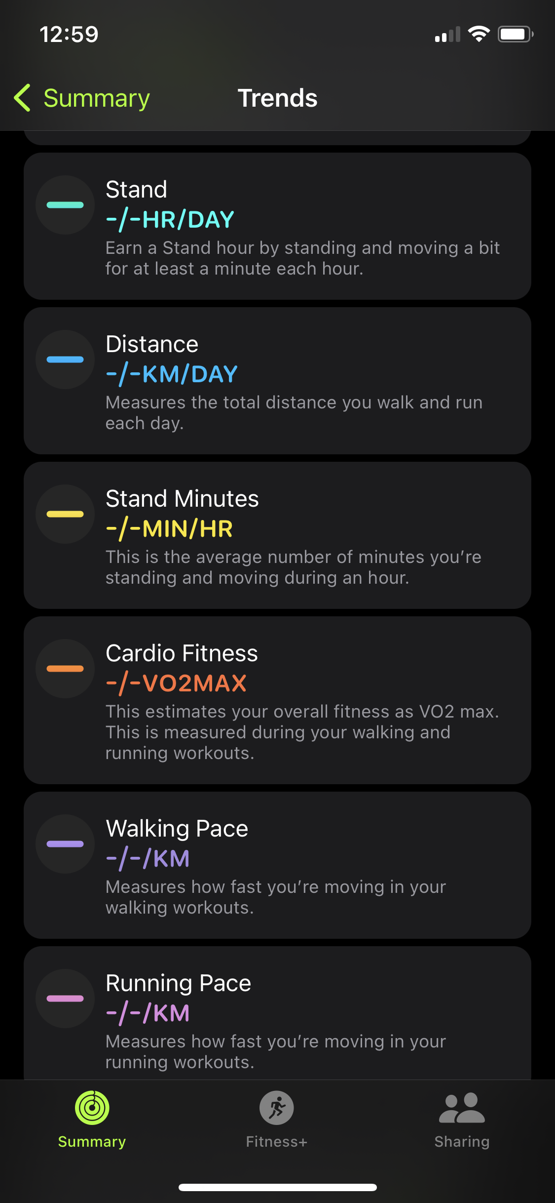
- Move = red
- Exercise = yellow-green
- Stand = cyan
- Distance = blue
- Stand Minutes = yellow
- Cardio Fitness = orange
- Walking Pace = purple
- Running Page = pink
To avoid confusion and association, I decided against using a completely new colour palette for the Rest Day rings. Not only was there already a meaning attached to every colour, if a palette similar to ADAMBUNKER's mockup were implemented, additional explanations would be required for the different colours. Therefore, I opted instead to use a different shade of the original colour for each ring. The Rest Day rings altogether have a lower opacity (i.e. 80%) such that it resembles an "in-between state" between the default (i.e. when rest is not enabled) filled and unfilled rings.
Next, I created the fixed indicator that appears on the Summary tab whenever Rest Day is enabled. It is a small, banner-like element positioned above the Activity card/component. After assembling with the appropriate colours and font and text settings, I had successfully built the new Summary tab and Activity pages!
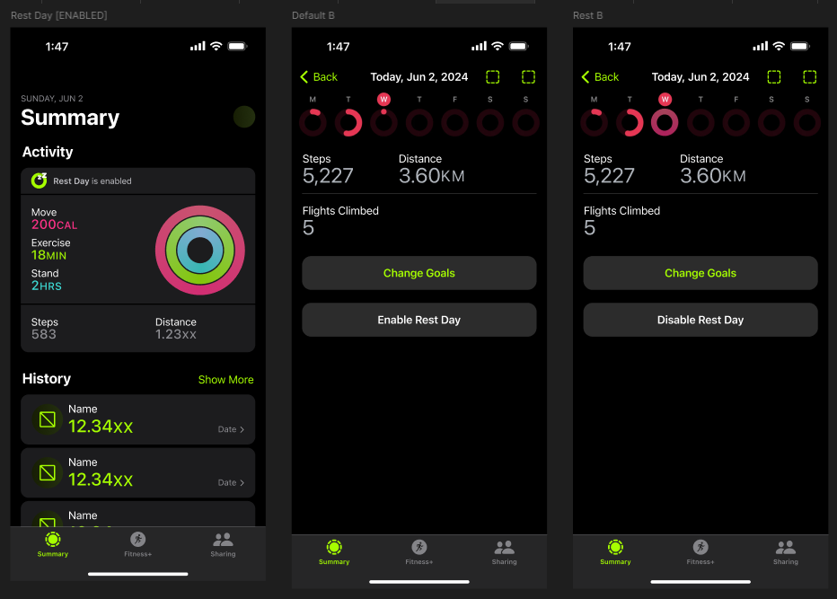
Middle: Default Activity screen with the new Rest Day button added
Right: Activity screen when Rest Day is enabled
🔬 Testing
Why Apple Watch? It is "the ultimate device for a healthy life."
Not sponsored, rather, rigorous testing was done for both the iPhone and Apple Watch.
Additionally, this meant researching ways to modify existing Fitness screens on the Apple Watch and assessing whether additional buttons, icons, or other UI elements would be feasible for the already compact Watch screen size.
The first question I posed was: would customers purchase an Apple Watch before an iPhone? Though it seems very trivial, I attempted to start at the most basic concern of whether it was possible to include "rest" on the Fitness application on the Apple Watch. For example, if the answer was yes, then testing would differ compared to if the answer was no because of the differences between the iPhone and Apple Watch versions of the Fitness application.
The next concern was the overall importance of the Fitness application on the Apple Watch. This was an attempt at addressing the integration of a Rest Day toggle into areas such as the Control Center or Watch Faces.
After several adjustments, testing results showed the need for more informative elements within the application.
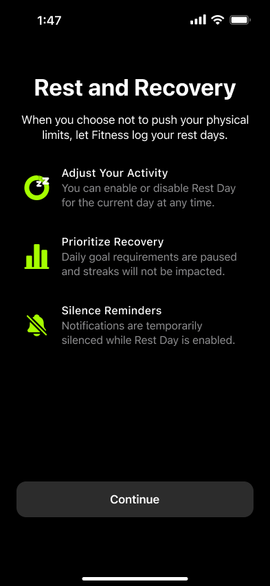
Starting with the mobile application, I subsequently sketched one new onboarding screen that introduces and explains the Rest Day feature. It mirrored the layout of the first Welcome to Fitness onboarding screen and concisely described the various functionalities.
As well, I added one new menu item in the account settings. Similarly to the Activity page, it was placed below Change Goals.
Currently on the Activity page, users can view a calendar overview where each date displays coloured rings representing the corresponding date's fitness progress. To accommodate Rest Days, the rings will utilize the new colour palette. Despite the similarity in color schemes, the calendar view remains visually accessible. The colours are distinct enough to be distinguishable even for users with colour vision deficiencies.
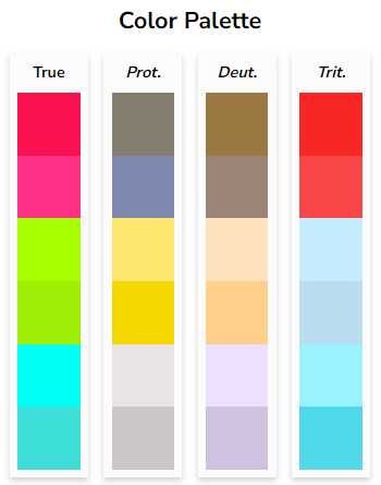
For each colour pair, top = default/original ring colour, bottom = new Rest Day colour
Source: Coloring for Colorblindness by David Nichols
- True = "true" colour
- Prot. = person with protanopia
- Deut. = person with deuteranopia
- Trit. = person with tritanopia
⭐ Final Designs
The previous testing phase allowed me to confidently move forward with making final design iterations.
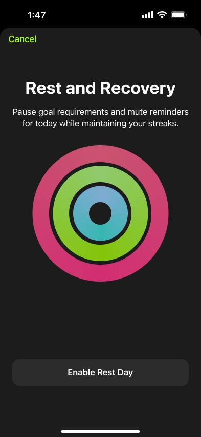
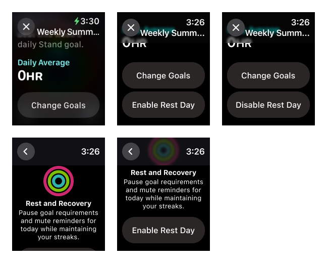
On Figma, I created a confirmation screen that will appear each time after the Rest Day button is pressed. By integrating this screen at multiple touchpoints, it keeps users informed about Rest Day's functionality while also serving as a confirmation dialog prior to any application state transitions. I kept the design minimal and condensed the main points from the onboarding screen into a single statement. After reviews and adjustments, the statement that best described Rest Day in a concise manner became: Pause goal requirements and mute reminders for today while maintaining your streaks.
I utilized my personal Apple Watch to capture screenshots of all relevant screens. Subsequently, I built the Rest Day versions using the new colour palette. In addition, I streamlined the data displayed by retaining only the running total of each ring's metric (i.e. similar to the new rest UI of the Summary tab on the iPhone). This design decision decluttered the interface and reduced the importance of goal completion, further reducing cognitive load.
To further maintain design consistency on the Apple Watch, I added a fixed Rest Day banner-like indicator on the page displaying the activities recorded for the current day. Positioned at the bottom of the screen, it does not obstruct the primary focus: the list of activities.
After conducting some tests, rest days had low priority on the Apple Watch. A Rest Day button was placed under the Change Goals button on the Weekly Summary screen. The visual indicators for Rest Day are the rings on Watch Faces and the main application screen, both utilizing the new colour palette. Additionally, the aforementioned confirmation screen was integrated into the Watch after the same touchpoints, with a slight design alteration to suit Watch screens.
Ultimately, the most efficient method to enable and disable Rest Day is through the iPhone Fitness application. A short scroll down on the mobile activity page is notably faster than scrolling all the way down the Weekly Summary page by touch or the Digital Crown on the Apple Watch.
To ensure returning users are properly introduced to Rest Days, I designed a dedicated "What's New in Fitness" screen for the mobile application. This screen highlights the new Rest Day feature and its functionalities. Hence, new Fitness users are introduced via the onboarding process with the new Rest Day onboarding screen. To build the "What's New in Fitness" design, I referenced existing Apple applications What's New in... designs for inspiration and consistency. I noticed that they often followed the same format (i.e. primary title at the top, a few secondary headings with informative bullet points, and a Continue button at the bottom), and familiarized with the language and sentence structure used.
All together, I had successfully built all important screens of the Apple Fitness application on Figma in both iPhone and Apple Watch frames. Please take a look at the following images, and feel free to browse around with the embedded Figma component!
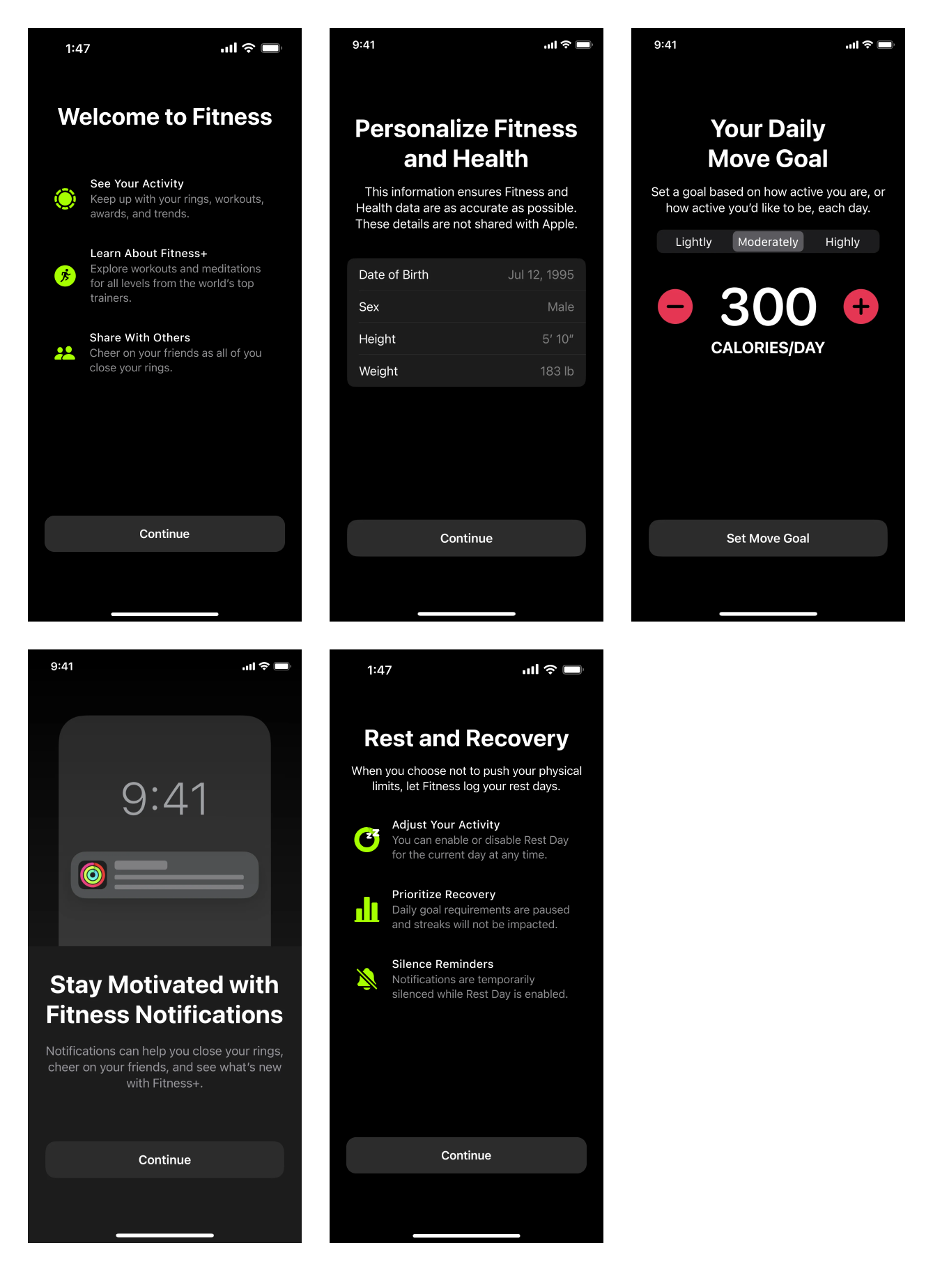
Image source: Mobbin
Right column: Skeletal view of the Summary tab and account settings when Rest Day is enabled
- Left: Activity screen for the current day
- Middle: Activity screen when scrolled down
- Right: Confirmation screen after Rest Day button is pressed
- Left: Activity screen for the current day
- Middle: Activity screen when scrolled down
- Right: Confirmation screen after Rest Day button is pressed
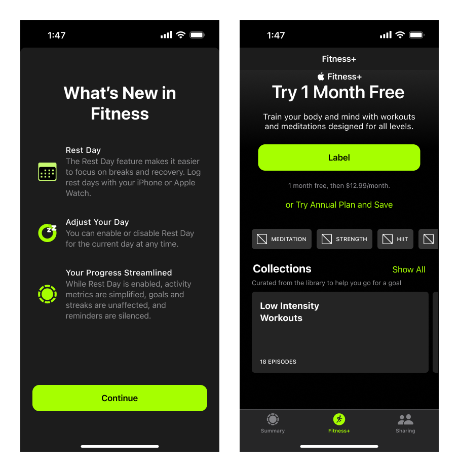
Right: Skeletal view of the Fitness+ tab featuring a new collection of Low Intensity Workouts with 18 episodes
Right column: Recreation of the pages after Rest Day is enabled
- Left: Screenshot of the current Weekly Summary screen scrolled to the bottom
- Middle: Recreation of the previous screenshot with the Rest Day button
- Right: After Rest Day is enabled
❓ What I Learned
Overall, I learned several valuable lessons that shaped both the design process and my approach to problem-solving.
I deepened my understanding of the Apple ecosystem and its design system, particularly its guidelines, interface patterns, and the importance of maintaining consistency across devices.
In addition, I furthered my skills in crafting effective research questions in terms of asking targeted questions. The responses and feedback led me to asking follow-up questions which allowed me to ultimately make better design decisions.
Another takeaway was understanding the different types of users, and the importance of creating broader appeal. Given the large market for Apple products, I learned how to better cater to both niche and general users. This coincided with the ability to identify user pain points. I improved my empathy skills which helped me prioritize and address them in the design process.
💭 Next Steps
I would love to see the Rest Day feature come to fruition, but I am not as proficient in Swift (Apple's programming language). As well, it would be nice to see Apple implement a feature to pause rings for the current day... just to give users the oppportunity to. Because right now, the option of lowering the goals then change it again tomorrow is very inconvenient.
I would also love to get my hands dirtier in the testing phase. Personally, I prefer having a functional prototype outside of Figma as it allows for more freedom in coding the functionalities. It would allow me to better understand any hardware or software restrictions.
Furthermore, I would like to conduct more focus group testing. This could allow me to monitor user engagement, study pre-launch metrics and simulate post-launch insights.