🚀 Intro
I designed and developed a custom website for my friend's up-and-coming business. I have known her for quite some time, and her love and passion for matcha was my central inspiration.
I had the opportunity to expand her vision and online presence with a functional webpage that is public and equally as shareable and presentable as an Instagram profile link.
Currently, I collaborate with her to extend design workflows and upcoming business goals with Square Web Payments SDK. In December 2024, I migrated from plain HTML, CSS, and jQuery to React.js. In July 2025, I migrated from using only React.js to using Next.js (TypeScript).
Check out the latest portfolio entry: Website for a Small Business (Full Stack version). I discuss more about the transition to Next.js and TypeScript, as well as SSR vs. SSG, Lighthouse performance scoring and the performance, accessibility and SEO improvements made. Additionally, I document the development process of building a full stack web application with Next.js, PostgreSQL, Prisma ORM, and the Square Checkout API.
See 📑 git push updates for version release notes.
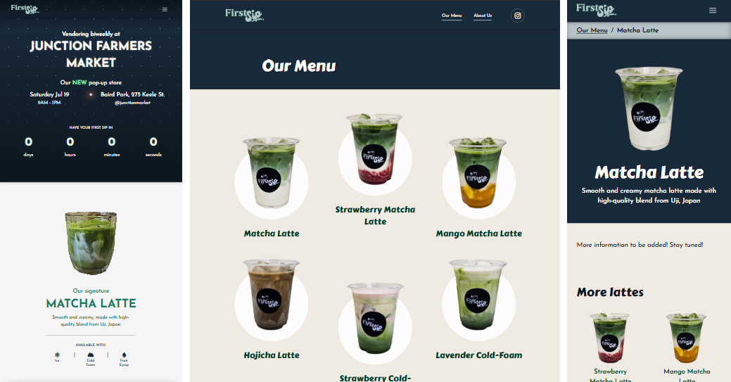
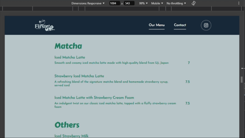
- Left: homepage on smaller devices
- Middle: menu page on larger devices
- Right: /menu/matcha-latte page on smaller devices
Throughout your reading journey, I will include buttons to reveal some supplementary information. These only provide additional information and are not mandatory, but I highly recommend reading them!
First Sip Matcha, a matcha bar based in Toronto, Canada
- Instagram: @firstsipmatcha
If you are not familiar, matcha is a fine powder made from ground green tea leaves. It is specifically derived and processed from the leaves of the Camellia sinensis plant.
It is made through three separate stages:
- Cultivation - Tea bushes are shaded for several weeks before harvest to reduce sunlight exposure
- Increases the chlorophyll and amino acid content
- Produces its vibrant green colour
- Harvesting - Only high-grade young tea leaves
- Stems, veins, and impurities are removed
- Processing - Leaves are steamed, dried, then stone-ground into a fine powder
- Steaming prevents oxidation
🏆 Goals
The goal was to create a tailored solution that effectively showcased the brand's identity. The website needed to complement the existing Instagram profile while being engaging and responsive across various devices. Moreover, the design had to be scalable to accommodate future web features, pages and functionalities.
What motivated me was the challenge of successfully combining creative design elements with the technical aspects to support and aid in business growth.
⏳ Development
What makes for a successful online presence in the food and drink industry?
The most famous coffeehouse chain is Starbucks, a brand that many people likely first think of when prompted with drink stores and cafes. Another brand I recalled was Chatime, a global franchise specializing in tea-based drinks. Both companies maintain thriving websites that allow users to view current and upcoming franchise news, place online orders via web or mobile application, and explore merchandising options.
With additional research, I complied a list of homepage designs of several companies and small businesses. On a FigJam file, I included a screenshot of each and documented the structure of their main navigation element, which often was implemented as a header.
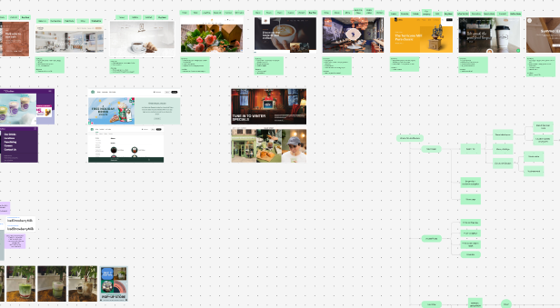
Figma's FigJam feature served as a great tool for brainstorming. Feel free to browse around my FigJam file with the embedded Figma component above!
In conclusion, I have gathered that:
- site composition and style build atmosphere
- atmosphere is created through the placement of elements, colour palette and typography, for example:
- lighting, items and colours in images
- overall usage of bright vs. muted or dark colours
- fancy vs. minimalistic font styles
- atmosphere estabishes first impression
- navigation options tend to share common patterns, for example:
- variations in showcasing what the brand offers - using terms like "menu", "our menu", "our services", "shop"
- general brand overview, especially for smaller and lesser-known brands - "about", "about us", "gallery", "learn"
- information on where and how to reach the brand - "contact", "contact us"
- a call to action (CTA), which varies depending on the type of brand
Therefore, these are some of the foundational elements of a homepage.
Next, I moved on to building the information architecture. I planned to follow the established aesthetics my friend had used in her Instagram posts. Considering how the business was still in its early stages, a minimal and concise navigation was deemed sufficient. More information regarding this in 📑 ideation.
First, I identified the types of users:
- Returning customers
- Returning stakeholders
- New customers (or general consumers)
- New stakeholders
Second, I clearly identified the user goals. There would be a priority in information access such as the drinks menu, contact details and store location(s).
Third, I used green text boxes in FigJam to map out the user flow for each user goal identified, using specific shaped text boxes:
- Circle: start/end point
- Rectangle: user steps, viewable pages
- Diamond: conditional/decision point
- Parallelogram: actions, inputs, outputs
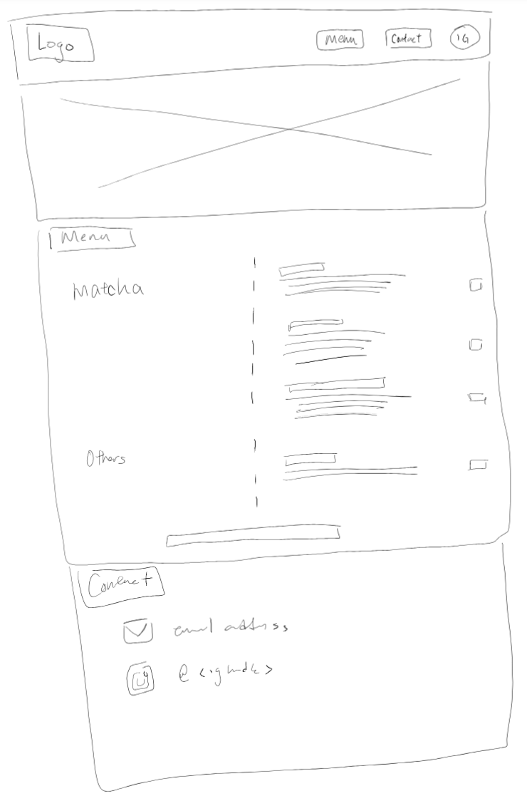
Last, I sketched out the homepage and navigation header structure. By physically sketching these out, I furthered my understanding of common layout patterns and the placement and quantity of information.
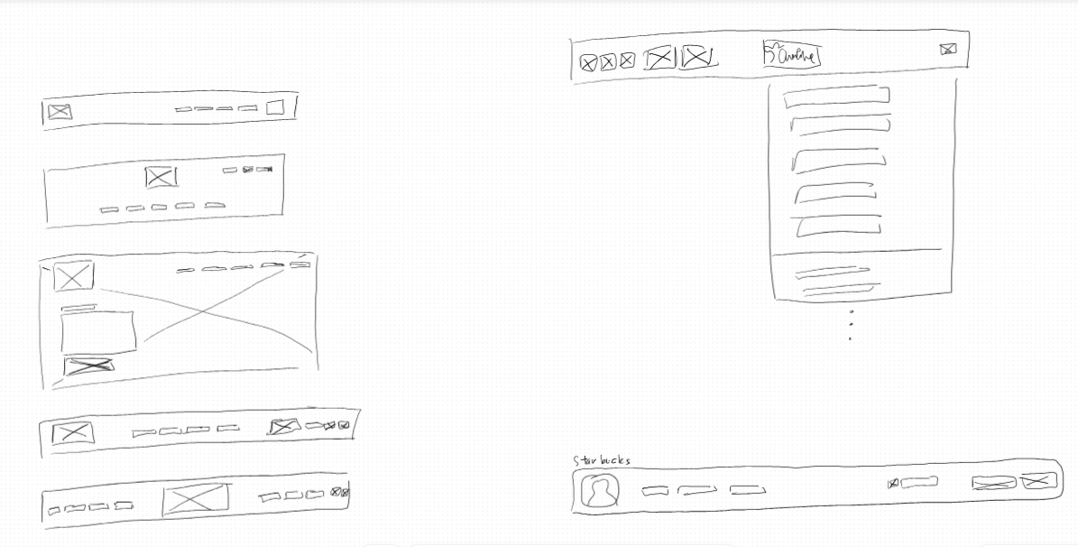
Top right: Sketch of the Canadian Chatime website and navigation menu layout
Bottom right: Sketch of the Starbucks navigation layout
Afterwards, I opened a new Figma file to begin working on the design system!
Using the existing Instagram posts, I identified the font styles used:
- Carter One, for headings
<h1>to<h6> - Josefin Sans (a close replica), for main text elements (i.e. body text, interactive elements)
These two font families are robust, open source, easily accessible and free to use! I also utilized TypeScale to help structure my typography.
I also based my colour palette on the Instagram posts. With the amount of greens used, and its relation to matcha, it was logical to adopt green as the brand colour. As well, I wanted to pursue a minimalistic theme, and so, a neutral white colour as the background would be optimal.
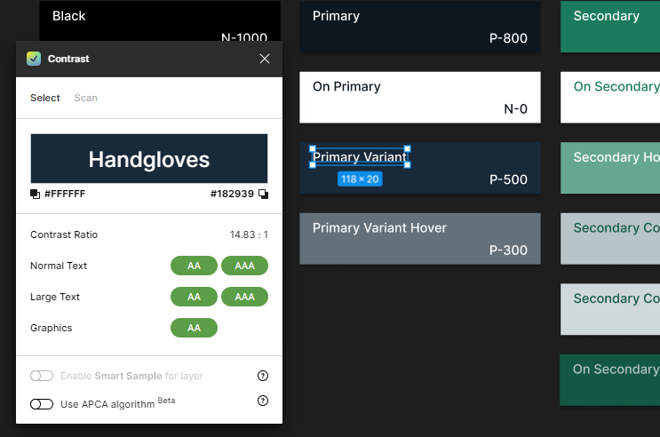
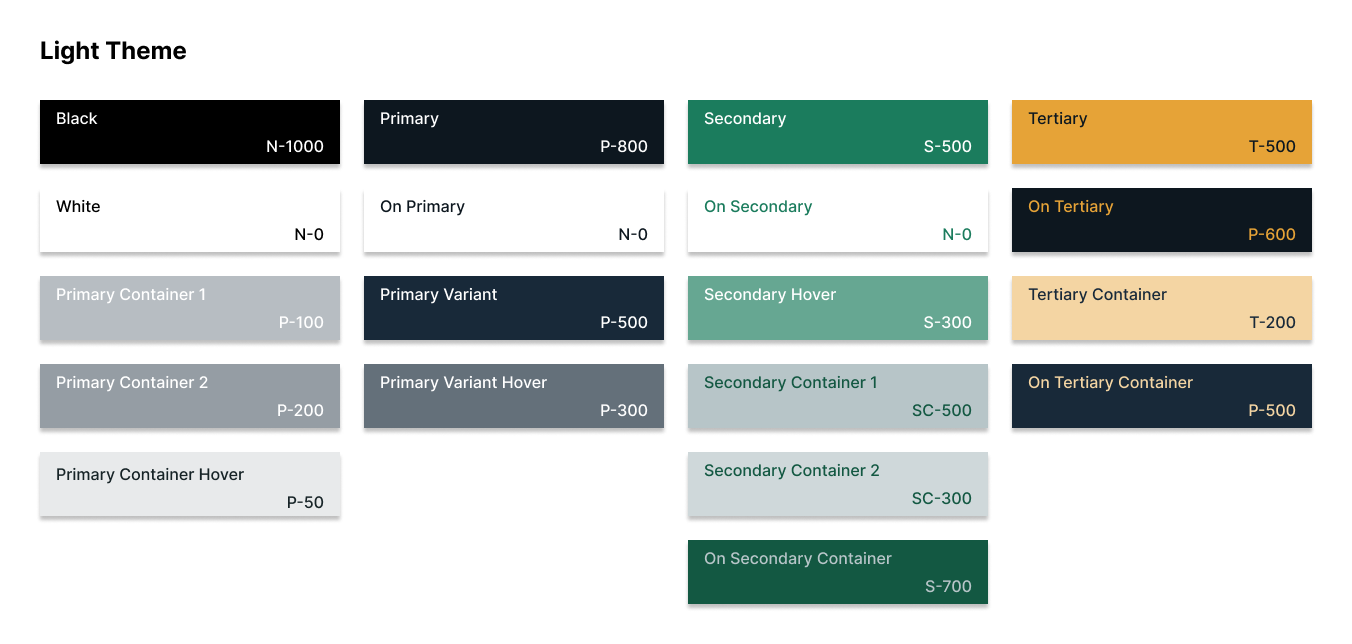
With an additional focus on accessibility, I generated a tonal palette for each colour using the Foundation: Color Generator Figma plugin by Jorge Fernandes.
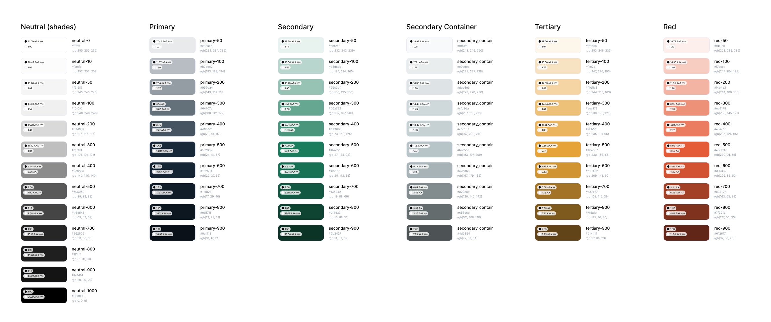
- 13 shades of neutral colours (black and white)
- 10 shades of the primary colour
- 10 + 10 shades of the secondary colour
- 10 shades of the tertiary accent colour
- 10 shades of the red accent colour
Then, I built my full color palette and labeled it as the Light theme. The layout and labels were inspired by the Color Guidance by Material Design. The Contrast plugin by WillowTree was incredibly useful in selecting approrpiate shades and tones.
📈 Early Ideation
For the initial design of the website, I determined that having a single page was sufficient. At the time, neither the drinks menu nor the business had been developed far enough to justify having multiple pages filled with text, elements and interactive components. Keeping the primary navigation short and sweet, I made a general sketch of the entire page:
- Interacting with the navigation menu will scroll to the corresponding section on the page
On larger screens, the primary navigation in the header includes all three elements: the drinks menu, contact, and an Instagram icon leading to the Instagram profile. This configuration was finalized after my brainstorming process:
- Brainstormed a list of relevant menu options applicable to any type of user visiting this business website
- Categorized the list into different groups based on hierarchy and similarity [via the card sorting method]
- Drafted an information architecture
- Rearranged items after further testing
On smaller screens, users need to utilize the menu to interact with the primary navigation.
The menu icon is visible and accessible to open on all screen sizes that do not display all three menu elements simultaneously, which was typical on smaller screen sizes. More information regarding this in 📑 project testing.
The CTA button holds link to the Instagram profile. As a small business who is currently primarily utilizing Instagram for promotion, the website should direct user attention there. The button shape is round, which contrasts the rectangular text elements of the other two menu options, and is spaced slightly further apart from the two to stand out.
I took inspiration from the drinks menu and created a variation of the design for the website. These sections, including the contact section, were kept simple to allow for future design iterations and expansions.
The structure of the responsive layouts was determined using different grid layouts in Figma.
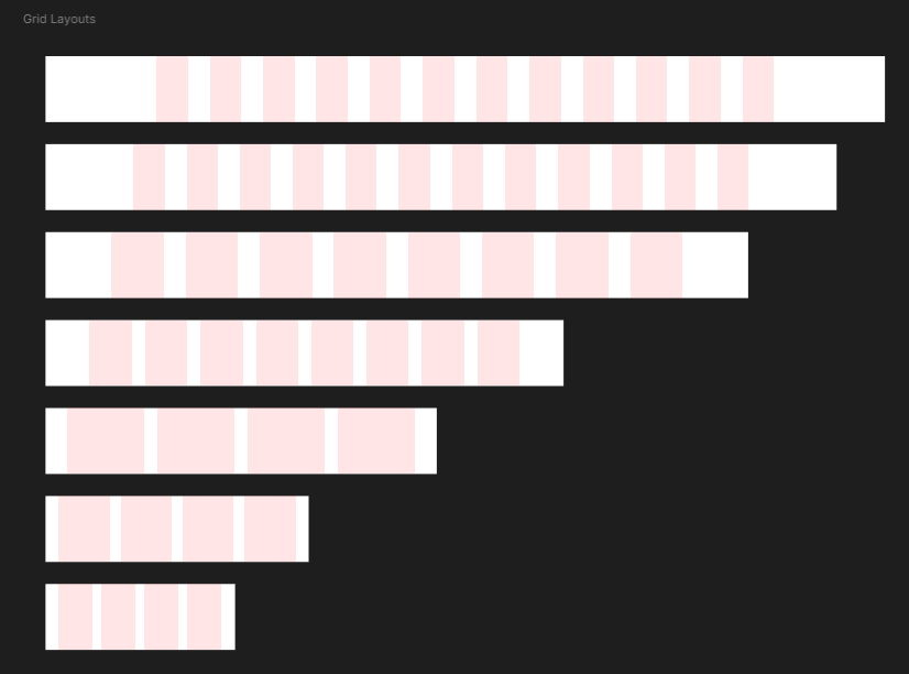
The breakpoint values (in pixels) are 346, 480, 713, 944, and 1280. Device widths up to and including 943px (ranging from mobile phones to medium-sized tablets) will have a smaller typography that corresponds to smaller devices. Device widths starting at 944px (ranging from larger tablets to desktops) will have a larger typography that corresponds to larger devices.
For device width (in pixels):
- 1441+
- Column count: 12
- Type: Center
- Width: 57
- Gutter: 40
- 1280-1440
- Column count: 12
- Type: Stretch
- Margin: 160
- Gutter: 40
- 944-1279
- Column count: 12
- Type: Stretch
- Margin: 120
- Gutter: 40
- 713-943
- Column count: 8
- Type: Stretch
- Margin: 80
- Gutter: 24
- 480-712
- Column count: 4
- Type: Stretch
- Margin: 40
- Gutter: 24
- 346-479
- Column count: 4
- Type: Stretch
- Margin: 24
- Gutter: 20
- ≤345
- Column count: 4
- Type: Left
- Width: 59
- Offset: 24
- Gutter: 20
Next, I moved on to building high fidelity prototypes. Going forward, each element (e.g. text, subtitle, label, icon, etc.) was contained in their respective groups (also known as frames in Figma), with size constraints set according to the appropriate grid layout. This ensured that each prototype was responsive to the device size. I began by designing for the 1280-1440px frames (designs on larger screen sizes) and then proceeded to design and build the other frames in descending size order.
First, I built the main navigation header. I was able to test and adjusted the text values and the size of the Instagram icon accordingly.
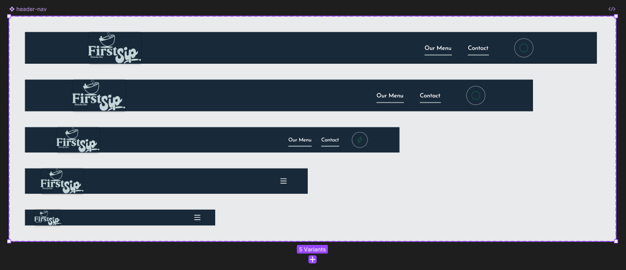
I remembered that I had a copy of the Octicons - Github's icon set design file on Figma, so I used their icon set as a temporary placeholder. With this, I planned and built variants of a CTA component.
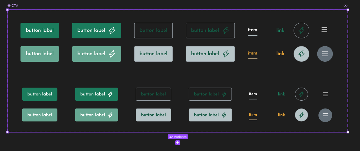
- Size: large, small
- Type: primary (button), secondary (button), header item, link, icon (button), menu (button)
- State: default, hover/pressed
- Has icon: no, yes
I gradually built a high-fidelity prototype the drinks menu section first:
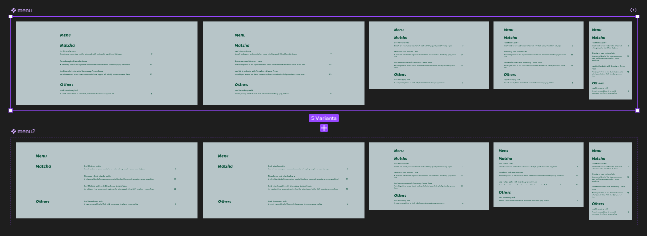
- Top row: base design; replica of the Instagram post
- Bottom row: variation of the base menu design
Even the high-fidelity prototypes went through multiple iterations to achieve the "highest" level of fidelity.
Each element has different sets of constraints aligning to the grid layouts. All long lines of on-screen text (e.g. text inside <p>) were constrained to prevent them from running too long on one line. This is to maximize readability for users.
Then, I built the general layout for the contact section:
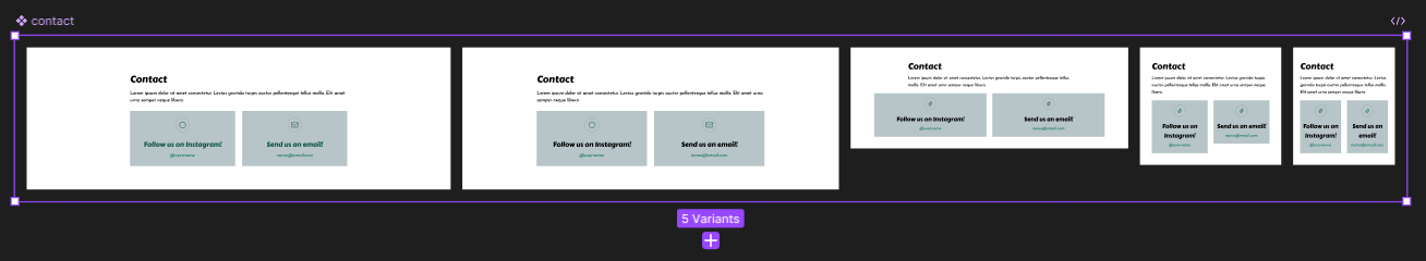
Again, being in its early stages, I kept the quantity low and concise. I prioritized the Instagram profile, as well as a slot for a future business contact email.
🔬 Testing
My preferred method of testing is to actually get your hands dirty.
I thought that building my own webpage demo would be far better to my likings as opposed to utilizing Figma's prototyping features, so I launched Visual Studio Code (VSC), my code editor application, and migrated all pages into individual HTML files. In addition, I could easily publish a demo and share it with others.
I utilized Sassy CSS/Syntactically Awesome Style Sheets (SCSS/SASS), a popular and powerful CSS preprocessor. I was introduced to SCSS in a previous project, and it made plain CSS coding more efficient and intuitive. The two VSC extensions that helped me test my code were Live Sass Compiler by Glenn Marks and Live Server by Ritwick Dey.
After some simple JavaScript coding with JQuery, I had successfully built a functional web demo. It provided more clarity in testing both technical and visual aspects. By utilizing the Inspect tool in my web browser, I adjusted some of the layout spacings and font properties of my typography. Consequently, I was able to establish a rule for such spacings and incorporated it into my design system.
My focus then shifted to UI and UX testing. Regarding the UI, I experiemented with the colours and assigned values to various components such as underlines, elevations, and shadows. I also tested all other font properties and identified the most appropriate spacing values. For example, on the main navigation header, I reduced the top and bottom padding of the text element of a menu option. This reduced the space between the text and the bottom border, and overall tidied the element.
One major change made was to have all long lines of on-screen text (e.g. text inside <p>) constrained to prevent them from running too long on one line. Each element had different sets of constraints aligning to the grid layouts. This is to maximize readability for users, and allows for responsiveness.
⭐ Final Designs
After refining my own design system and building the navigation menu modal, I added the changes to my code and updated my demo site pages.
Finally, I designed the hero component: the section that appears first, positioned above the other two on the home page. Since the hero component often highlights recent franchise news, I opted for a banner-like design to prominently display the current upcoming news:
Then, I utilized free SVG Font Awesome versions of all the icons used:
- Instagram logo
- Hamburger menu
- Shop, plant, kitchen set, location pin - on the hero section
- Mail - on the contact section
Last, I refined the HTML code by adding Accessible Rich Internet Applications, also known as aria tags, which are attributes added HTML elements to improve accessibility. For instance, I added the attribute aria-hidden and set the value to false for elements that are visible to the user, like the primary navigation menu on larger screen sizes. Similarly, I set the value to true for elements that are not visible to the user, like the primary navigation menu on smaller screen sizes.
With all these changes, I finally completed the initial design of the First Sip Matcha website. Check it out here!
💭 Next Steps
As I only used the basic (and bare minimum, really) HTML, CSS, JS coding conventions to build the prototype, advancements could include utilizing frameworks like Flask or Django. Additionally, I would need a better organization system for the web files (i.e. building a specific folder system... an information architecture, if you will).
And of course, as the business expands and evolves, the website should follow suit. In the future, I would like to add more features, elements, and even branch out to new pages. See 📑 git push updates for version releases.

💬 git push updates
git push updates log:
- 📅 07/22/25 → Lighthouse performance score enhancements
- added
priority={true}attribute for next.js Image components + reduced image sizes for improved performance - implemented ARIA attributes for improved accessibility
- hamburger menu button:
aria-hidden="true"+disabledon larger device sizesaria-label="Open menu"+aria-expanded="false"by default,aria-label="Close menu"+aria-expanded="true"when the menu modal is openaria-controls="primary-hamburger-nav-menu"
- menu modal:
aria-modal="true"+id="primary-hamburger-nav-menu" - logo link to home page:
aria-label="Home, First Sip Matcha Bar" - homepage carousel:
aria-roledescription="carousel"in the carousel container elementaria-label={`${index + 1} of ${list.length}`}+aria-roledescription="slide"attributes on individual slides
- hamburger menu button:
- added
role="presentation"attribute on decorative images - added
metadescriptions, added screen-reader only text in the<a>elements without descriptive text + adjusted CSS values for improved SEO
- added
- 📅 07/20/25 → NextJS port v2.0
- TypeScript programming
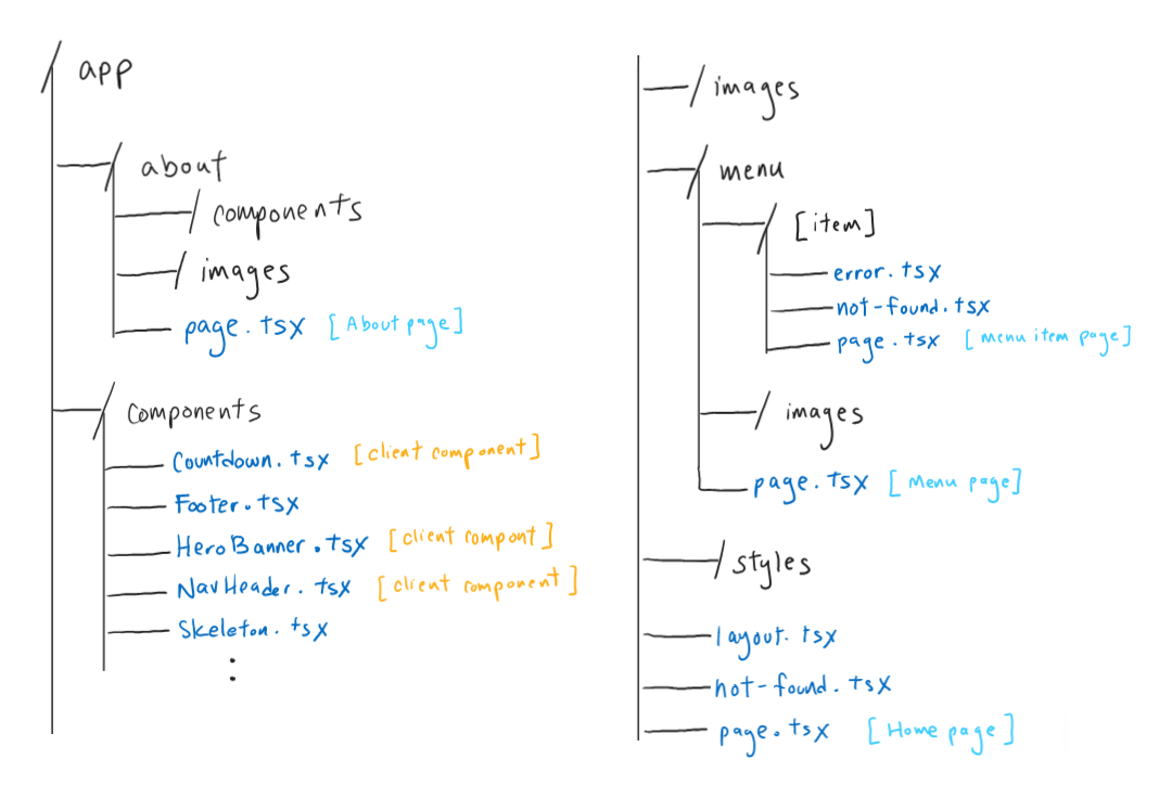
next.js file architecture inside the app folder - static export hosted on github pages
- implemented static dynamic route segments using
generateStaticParams()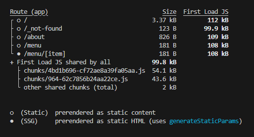
- each menu item has an individual route (i.e. website page)
- extended menu
jsondatabase to include a uniqueidper menu item - retrieve menu info from
jsonfiles usingreadFileSync()andJSON.parse()
- individual route for each menu item
- page design/layout:
- main information (display image, item name as title, item description)
- secondary navigation: breadcrumbs
- item specific information (to be added)
- tertiary navigation: "related items" section (a small list of related menu items)
- page design/layout:
- implemented boundary navigation cases
not-found.tsx: custom page not founderror.tsx: custom error page as general fallback
- created skeleton loading component
- TypeScript programming
- 📅 05/20/25 → updated menu design
- 📅 02/14/25 → ui & ux improvements v1.9
- implemented infinite carousel
- adjusted adaptive element behaviour at 346px and 1440px breakpoints
- 📅 02/11/25 → ui updates
- 📅 02/08/25 → added home page hero carousel v1.8
- automated 10 000 ms rotation
- ability to display 1+ information pieces
- each piece on one carousel slide
- added new collab announcement
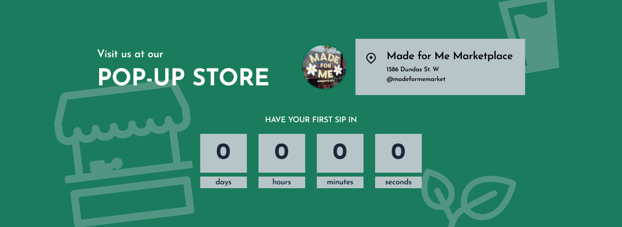
- 📅 01/18/25 → updated home page countdown
- 📅 01/04/25 → v1.7
- added footer
- added more to About Us page
- 📅 01/01/25 → mock database v1.6
- moved menu info to its own
jsonfile - simulates SQL database
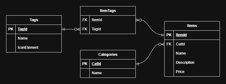
draw.io schema diagram - moved menu info to its own
- 📅 12/23/24 → v1.5
- updated some designs (Figma & front-end)
- built nav menu icon animation (via this LogRocket blog post by Ibadehin Mojeed)
- 📅 12/20/24 → ReactJS cont. v1.4
- cleaned up some files
- some routing/paths proofing for
Routes,BrowserRouter - favicon src inside
index.htmlfixed - patched 404 error on refresh
- 📅 12/19/24 → ReactJS port v1.3
- learned React & practiced by recreating/transforming the website into a component-based application
- utilized the same
CSSfile(s) - built progress bar using nprogress
- homepage countdown starts immediately
- renamed repository to
firstsipmatchafromfirstsipmatcha-website
- 📅 12/11/24
- v1.1: new home page design, separate pages for menu and about
- v1.2: mobile loading bug fixed
- 📅 12/01/24 → Initial commit v1.0