🚀 Intro
"My friend and I made an online photobooth so we don't have to keep paying $10 😂😂"... Yes, that is the tagline we went with.
A self-photo studio is a popular and interactive way to capture photo experiences. More commonly known a photo booth, it allows users to control the photo-taking process and receive physical prints and/or digital photo strips.
My friend really enjoys taking photos at Korean-style photo booths, and we share many of the same interests. She had seen several viral TikTok videos featuring people who built their own online photo booths and hosted them on personal websites.
At a surface level, these self-published booths were fine. However, most lacked intuitive design choices that would drastically improve the user experience. The root of the issues we identified was the absence of responsive designs for desktop and mobile web browsers, which contributed to poor cross-browser compatibility. Common pain points were:
- Inconsistent placement of on-screen elements
- Disproportionate size of the camera feed relative to other elements (making it difficult for users to view themselves comfortably)
- Unnecessary scroll affordances
By the end of the project, the web application has a fully developed front-end:
- Different layout designs for desktop and mobile platforms
- Improved the application's performance on mobile browsers by optimizing dynamic rendering on HTML
Canvas - Freestyle decorating feature for the photo strip with self-made assets as stickers, using the Canvas API and EventTarget API
- Incorporated different cursor styles at different touch points using the
CSScursorproperty - Ability to choose a camera filter
To add our own creative twist, we incorporated aspects from a mobile game into our photo booth project. This mobile game is called Love and Deepspace, and we both play it!
Throughout your reading journey, I will also include buttons to reveal some supplementary information. These only provide additional information and are not mandatory - but I highly recommend reading them!
Photo booths typically capture a set number of photos in quick succession and offer creative and customization options like backgrounds, props and decals, along with instant printing. Korean-style booths have popularized the "4-cut style", in which the final result consists of four photos in one photo strip. This trend has gained popularity for its variety of decorative "frames" (i.e. the design of the border that surrounded the photos), which can allow users to pose alongside pre-set overlay images of their favourite celebrities, "idols" or performers.
Examples of popular photo booths:
Love and Deepspace is a popular and successful 3D mobile game that currently features five main characters. We were excited by the opportunity to incorporate them into our project. We thought it would be fun for us and for other players to pose alongside these characters.
I do not own any aspect of Love and Deepspace, and no copyright or trademark infringement is intended. All rights go to InFold Games and Papergames.
🏆 Goals
The main goal was to adapt the traditional user journey of the Korean-style photo booth into a digital format.
The primary focus was to ensure the best user experience possible by successfully addressing the aforementioned pain points. One key design choice was the placement and size of the camera feed relative to other page elements. For the best experience, the camera feed should be as large as possible for any device type to allow users to view themselves comfortavly. Additionally, as each photo is being captured, users should be able to see previously taken photos with ease.
Some of the TikToks and websites we observed lacked a consistent location for the feed, required scrolling to find interactive elements, and didn't have a responsive design. The inconsistent placements and the need for scrolling detracted from the experience.
... In other words, it gave me the ick.
Since each screen involved only a few interactive elements and minimal text, everything relevant should be visible without scrolling. These "icks" motivated me to try really hard in adapting the essence of traditional photo booths into a modern design optimized for our favourite devices.
Additionally, I wanted to incorporate progress indicators throughout the user journey. I believe it is important to inform users of their progress, especially for new users unfamiliar with the process.
The secondary goal was to incorporate branding aspirations and complete this design sprint in one month. We began in early March, and I had planned to travel in April.
⏳ Development
Using the viral videos as the inital framework, I quickly built a demo using ReactJS. My friend and I jumped on a quick call and created a FigJam file for our brainstorming and a regular Figma design file for initial designs.
In the FigJam file, we used sticky notes to outline our overall goals, potential resources, ideas, and to-do lists. We then used text and shapes to map out user journeys and draft interface designs for both mobile and desktop.
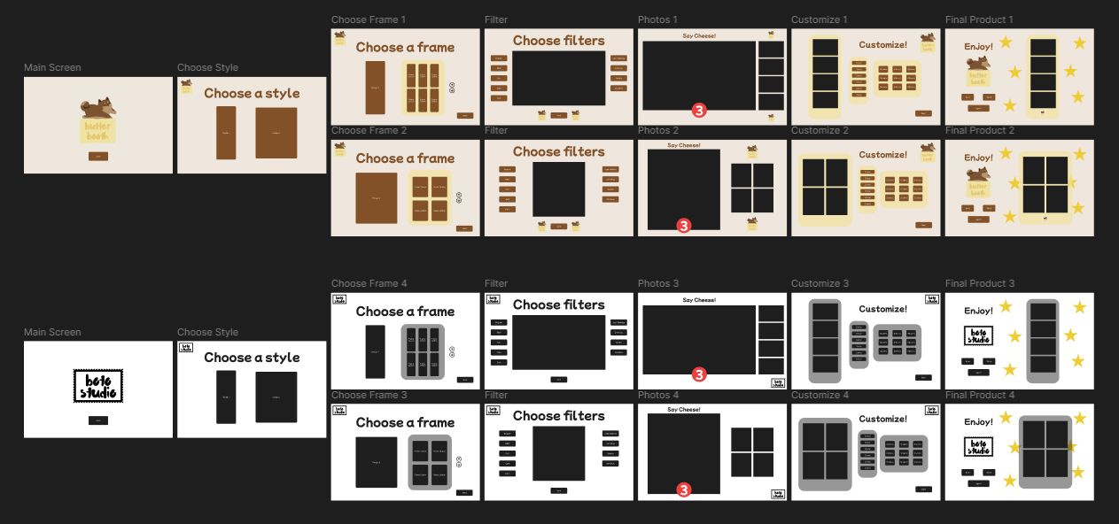
As previously mentioned, we were also greatly inspired by the Korean-style photo booths. The process we decided on for our photo booth was built off of the standard user journey:
- Choose a style (i.e. the design of the photo strip)
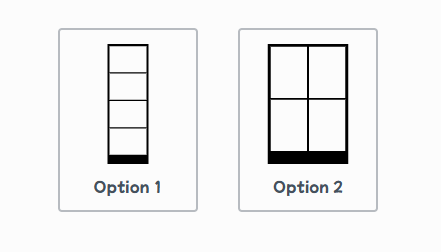
Currently, there are two styles available: one for portrait-oriented photos and one for landscape. Users may select one style per session. - Choose a frame (i.e. the border design surrounding the photos of the photo strip)
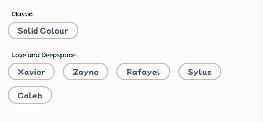
Currently, there are two categories of frames. Users may select one frame from either category per session: - Classic, which currently has one option: solid colour
- Love and Deepspace, which lists five options corresponding to the five main characters from the aforementioned mobile game
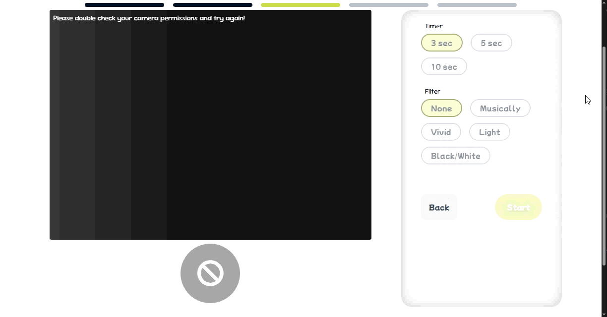
- Set up the camera
The application should prompt users to grant camera permissions. Once enabled, a live camera feed appears on screen, with dimensions determined by the selected style (portrait or landscape). Users can also configure:- The countdown timer for each photo
- Camera filter
- Capture photos in a 4-cut style
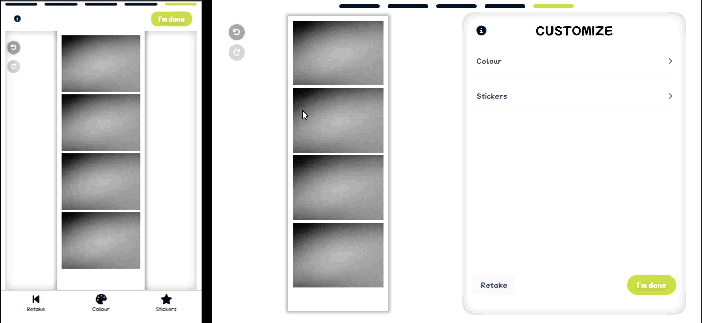
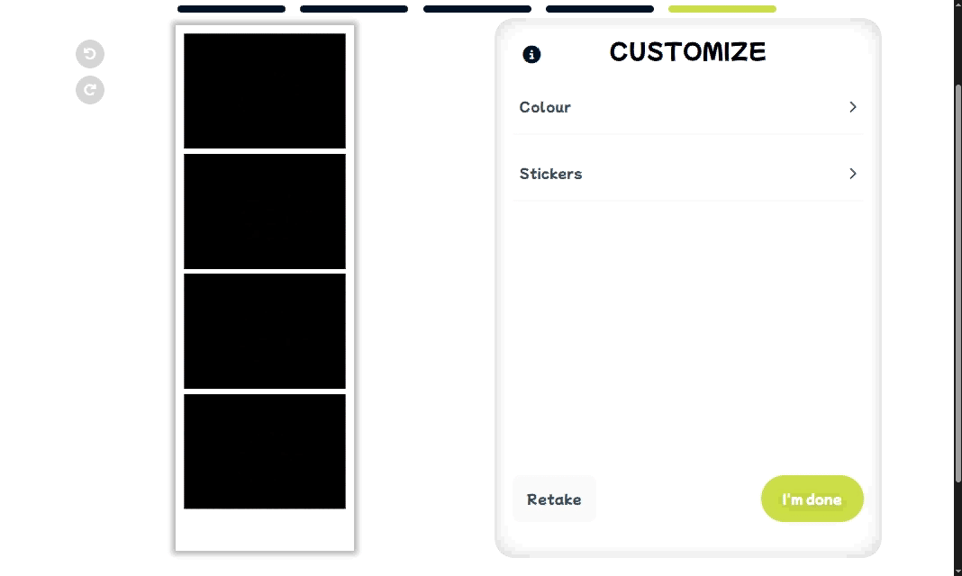
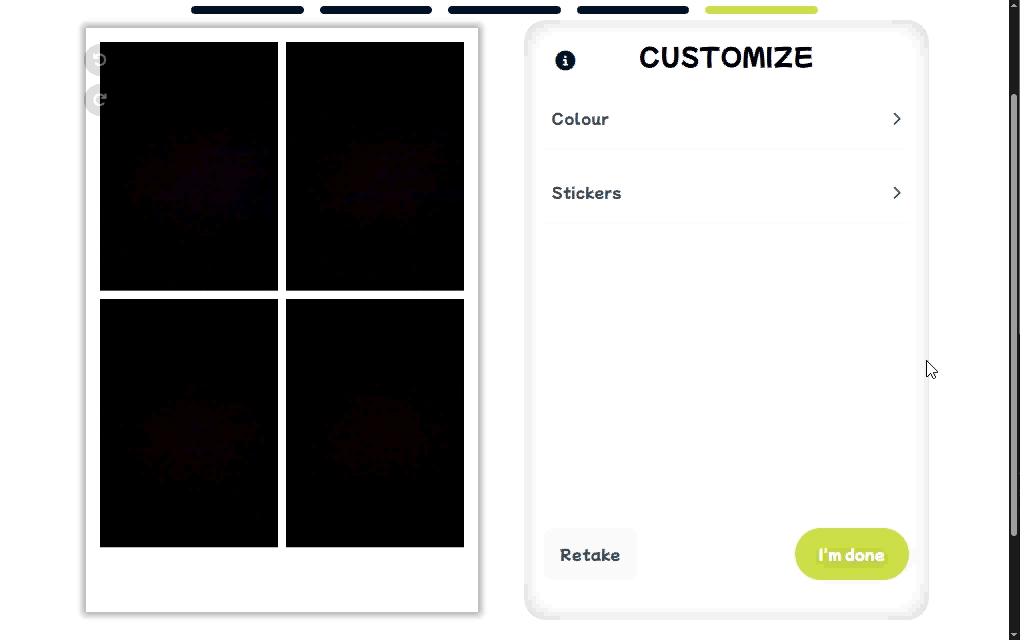
The application will capture four photos in succession, with a countdown preceding each shot. - Customize photo strip
Users can personalize their photo strip. Currently, we allow:- Colour selection for the frame
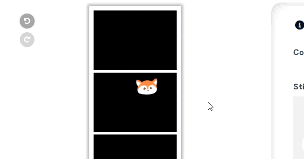
- Variety of stickers/decals
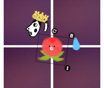
A selected sticker with interactive tools (from top to bottom): rotate, delete, resize
Stickers (from left to right): hyperpigmentation meme, crown*, blob with face*, water drop*
* Inspired by Love and Deepspace assets
📈 Early Ideation
While my friend gathered images, designed frames, and drafted colour options, I developed a basic camera application demo using react-webcam by mozmorris. I styled using Syntactically Awesome Style Sheets, a popular and powerful CSS preprocessor.
Next, I learned how to save images using the HTML <canvas> element, built separate screens for the style and frame selections, and implemented the necessary functions to connect these processes.
I also learned that the <canvas> element could be used to build games! Wow! The possibilities were quite endless once I figured out how to draw (e.g. shapes, images) and export the results.
Just as a side note, I will avoid writing about css, and properties ("props") and hooks each time they are used. The jist is that props and hooks are important parts of react programming.
I spent considerable time testing and configuring the dimensions of the camera feed. Intially, we wanted to perfect the landscape style, as it was the best orientation for users to pose beside an overlay of a character. We settled on a 7:5 width-to-height ratio for both the camera feed and the captured photos.
The feed needed to maintain this ratio responsively, and the css property aspect-ratio alone was not sufficient. Therefore, I implemented dynamic calculations to adjust dimensions in various scenarios as the camera feed loaded.
Using the dynamic viewport units dvw and dvh proved invaluable. Here are a few examples of the dynamic calculations:
Derive height from width:
'height':`${containerRef.current.offsetWidth * Math.pow(STYLE.ratio, -1)}px`Maintain appropriate size on larger devices:
'height' : `min(100dvh - 144px - 24px - 8px, ${containerRef.current.offsetWidth * Math.pow(STYLE.ratio, -1)}px)`, where the individual subtracted values correspond to the sizes of specific on-screen elements
After getting a screenshot of the camera feed, I drew the image onto a canvas object with drawImage() in order to save the image with the correct dimensions.
drawImage(sc, startX, startY, endX, endY, 0, 0, targetW, targetH)
sc: the screenshotstartX, startY: the x- and y-coordinate of where to start drawing fromscendX, endY: the x- and y-coordinate of where to end drawing fromsc0, 0: the x- and y-coordinate of where to start drawing on thecanvasobjecttargetW, targetH: the x- and y-coordinate of where to end drawing on thecanvasobject
Drawing the overlay images followed the same process. Finally, canvas.toDataURL('image/png') to export as a PNG image.
Then, I added the countdown timer and a placeholder for the filters (as we hadn't finalized what filters to include). The countdown functionality utilizes setTimeout.
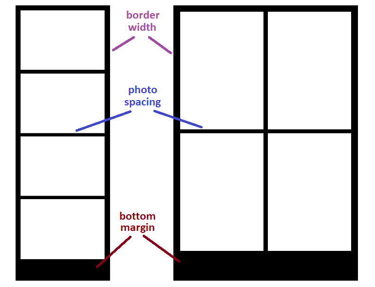
After successfully capturing the camera feed and storing four photos, I built the photo strip by drawing each image onto a canvas object with all relevant measurements. For example, calculating the start and end drawing coordinates based on the eyeballed values that looked the best for the border width, space between each photo and the bottom margin of the strip.
drawImage(img, 0, 0, img.width, img.height, xOffset, yOffset, imgW, imgH)
img: the image0, 0: the x- and y-coordinate of where to start drawing fromimgimg.width, img.height: the x- and y-coordinate of where to end drawing fromimg- we want to draw the entire image
- so we draw the entirety of
img
xOffset, yOffset: the x- and y-coordinate of where to start drawing on thecanvasobject- recalculated before drawing each image
- so each
imgwill be drawn at a different location according to its placement on the strip
imgW, imgH: the x- and y-coordinate of where to end drawing on thecanvasobject- how large an individual photo is on the strip
Next, I created a screen of the customization step. I added temporary border colours (default colour options like red, orange, yellow, etc.), and programmed the application to change the background colour of the canvas object when a colour option was selected. Additionally, I disabled the ability to scroll when swiping by touch on the canvas to prevent unintended scrolling.
My friend sent me the sticker illustrations she had drawn digitally. I added them inside a <ul> element, and programmed the application to draw the image of the sticker onto a canvas object when clicked/tapped. Most of the sticker designs were inspired by Love and Deepspace assets.
With more of the core functionality in place, we began developing our design system.
Initially, we thought choosing a photo booth and the colour palette would be easy. Oh, how naive we were... Those were actually the final pieces we decided on.
We browsed Google Fonts for a free (and robust) variable font that matched the ✨ vibe ✨ of our application. Using the Feeling search filters, we selected Sour Gummy (SG) and used TypeScale to help structure the typography.
We then migrated our sketches from FigJam to Figma. My friend, more familiar with the Korean-style photo booths, created Figma frames of the rough designs that mapped the user journey typical of those booths.
Meanwhile, I began adapting her designs into responsive ones. The structure of the responsive layouts was determined using different grid layouts.
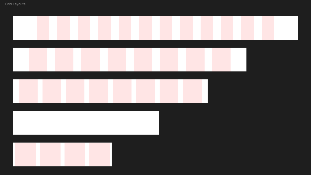
The breakpoint values (in pixels) are 346, 500, 740, 984, and 1180. Device widths up to and including 983px (ranging from mobile phones to medium-sized tablets) will have a smaller typography that corresponds to smaller devices. Device widths starting at 984px (ranging from larger tablets to desktops) will have a larger typography that corresponds to larger devices.
For device width (in pixels):
- 1441+: centers and maintains the following layout at 1440px
- 1180-1440
- Column count: 12
- Type: Stretch
- Margin: 120
- Gutter: 40
- 984-1179
- Column count: 12
- Type: Stretch
- Margin: 80
- Gutter: 40
- 740-983
- Column count: 8
- Type: Stretch
- Margin: 30
- Gutter: 24
- 500-739: centers and maintains the following layout at 499px
- 346-499
- Column count: 4
- Type: Stretch
- Margin: 10*
- Gutter: 20
- ≤345: centers and maintains the previous layout at 346px
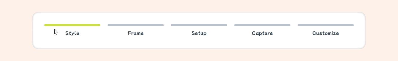
With these established guidelines, I brainstormed designs for the progress indicators. Since each step in the user journey featured a separate screen with differently sized on-screen elements, the indicator could benefit from being independent of those changing components and be positioned in a consistently visible location. Furthermore, the design should be minimal and occupy as little space as possible to maintain focus on the photo booth experience.
Since we still hadn't nailed our brand name or colour yet, our next step was to build a mini canvas application where users could move, resize, rotate and delete stickers freely.
🔬 Testing
At this point, I researched javascript libraries to handle drawing graphics and rendering on a canvas object. However, I was unable to find one that best suited the project, so I challenged myself to build one from scratch.
And so, through blood, sweat and tears rigorous testing, I successfully built my own using only the Canvas API and EventTarget API!
It is safe to say that canvas and I developed a new understanding.
I tried implementing various javascript and react-based libraries. But none worked well for my case. I won't rant too much, but most of the issues I encountered came up during mobile testing:
- Drawn images glitched and appeared as empty boxes
- The entire
canvaswas heavily zoomed in (so the drawn images were absurdly large... I had absolutely no idea why it happened) - Overall lag, or website crash
These problems occurred in Safari on my iPhone. The only glimmer of hope was that everything worked smoothly on desktop. I had exhausted my problem-solving patience, so I pivoted.
To my surprise, I was able to nail the ability to track and maintain user inputs on the canvas fairly early on. I used pencil and paper to brainstorm the logic of the various canvas functionalities our application needed. When a sticker is added, a new custom object is pushed to a list. This object contains relevant properties such as the image of the sticker, the x- and y-coordinates, width, height, and its angle (to be implemented).
The following EventListener functions were the main stars:
mousedown: pointer device is pressedmouseup: pointer device is releasedmousemove: pointer device is pressed and movedtouchstart: touch surface registers a touch pointtouchend: touch point leaves touch surfacetouchmove: touch point moves along touch surface
Testing mainly involved translating the logic into code and determining which set of instructions belonged under which EventListener. This required a lot of math and console.log usage. This was also when I figured out scaling and rotation.
The top-left of a canvas has coordinates (0,0). The drawImage() function draws an image starting at its local (0,0), which is at the top-left of the image. To draw an image at its correct location, we need to "move" the canvas to the desired spot: ctx.translate(x, y), ctx = cavnas's 2D rendering context.
Simple translation of a sticker involved getting the current coordinates of the user input (i.e. pointer device, touch point) and updating the x- and y-coordinates accordingly.
Resizing a sticker involved updating its width and height values, and limiting how quickly or excessively it could scale.
To draw an image at its correct angle, we need to rotate the canvas: ctx.rotate(angle). The rotation utilizes radians, so we can retrieve the angle with: Math.atan2(dy, dx), dy, dx = the vertical and horizontal displacements.
These will resize and rotate the image about the local (0,0), not at its center. I will later update this in ⭐ final designs.
Then, I moved on to testing our design system. Without a finalized colour palette, I was able to focus solely on typography and layouts. I built frames in Figma that followed the aforementioned grid layouts. With experience from past projects, I found it easier to balance aesthetics with user experience.
My friend and I eventually finalized the primary colour we wanted to use. From existing and popular Korean-style services, they often used light colours which greatly contributed to branding (and overall atmosphere of fun and whimsical). We adopted a light shade of green that had pear 🍐 in the name as our primary brand colour. We then got an image of a nice-looking pear from Google Images, and I let my friend have some fun by picking a shade of pink found within the image that complemented our green. With these two colours chosen, I decided to use the 60-30-10 colour rule that I used in previous projects:
- 60% of the page = neutral background colour
- 30% of the page = primary and secondary colours = text colour + brand colour
- 10% of the page = tertiary and accent colours
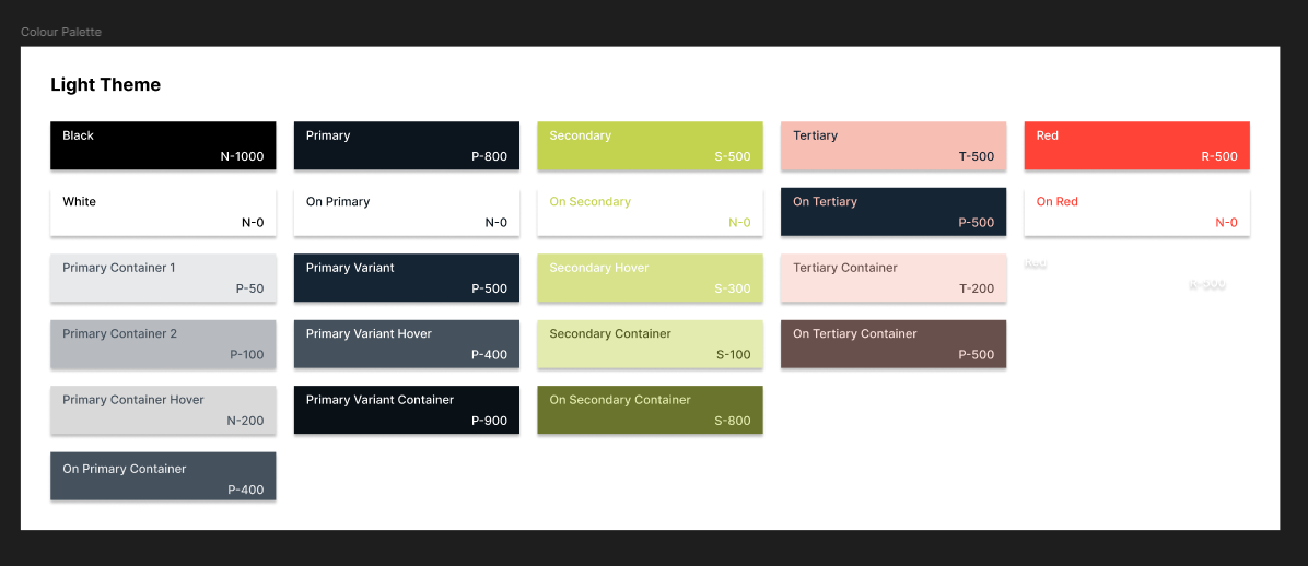
Next, I generated a tonal palette for each colour using the Foundation: Color Generator Figma plugin by Jorge Fernandes.
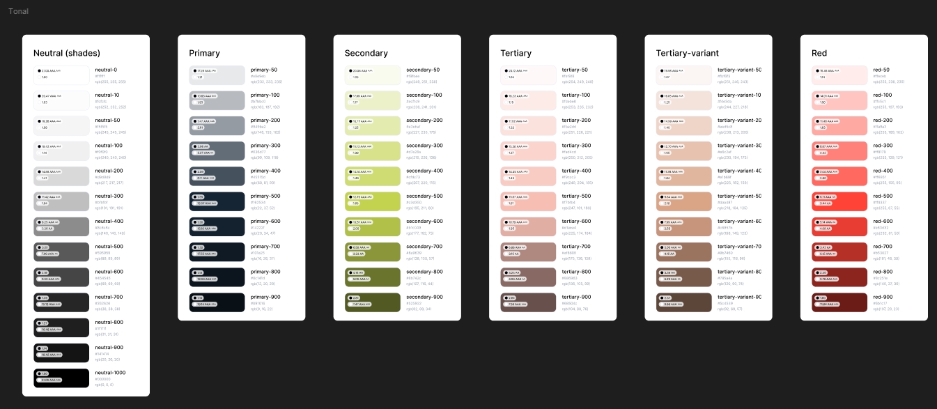
- 13 shades of neutral colours (black and white)
- 10 shades of the primary colour
- 10 shades of the secondary colour
- 10 shades of the pink tertiary colour
- 10 shades of the pink-variant tertiary colour (if needed)
- 10 shades of the red accent colour
Next, I built the full color palette and labeled it as the Light theme. The layout and labels were inspired by the Color Guidance by Material Design. The Contrast plugin by WillowTree was incredibly useful in selecting appropriate shades and tones.
Throughout various testing phases, my friend had her siblings play around, and I let a few of my other friends to do the same. This proved useful as it raised certain issues or critiques we otherwise wouldn't have thought of at this point. For example:
- the
draggableproperty of<img>elements - -webkit-tap-highlight-color
- testing with in-app browsers
- more instructions at the customization step
Additionally, my friend suggested improving the font style to better convey a playful tone. We chose Mochiy Pop P One from Google Fonts, a thicker typeface that better aligned with our visual goals. Because it wasn't a variable font (i.e. void of non-regular styles like italics and bold), I built the new typography while still holding onto the previous SG typography.
After adding the new font style into the Figma frames, it became more difficult to create hierarchy within the elements through varying text sizes. Especially for elements that used smaller text sizes due to the font's consistent weight (or thickness). Consequently, I decided to use SG for smaller body text, such as captions and helper text.
Lastly, I conducted testing on various progress indicator designs. I gathered images of common design patterns and listed the pros and cons of each design. Then, I consulted friends by asking them to associate each design with a purpose, function, or overall "vibe".
For example, consider the first four progress indicator designs shown in the image linked here:
- Dashed horizontal bar
- Single long horizontal bar with a knob - similar to an element that receives user input
- Single long horizontal bar without a knob - similar to a loading bar
- Chained circular numerical steps - often used in registration or purchasing processes
The second and third options less suited for a photo booth application. The second felt more like an element for customization rather than an overall progress indicator. The third best resembled a loading bar, and therefore best suited when the progress is visually continuous.
The first and fourth better conveyed the idea of sequential steps. The fourth was more informative and clearly communicated the user's position in the process. The first conveyed similar progression but without the use of additional icons or text.
After testing these two designs, here is a summary of the feedback:
- Dashed horizontal bar
- 🟢 Simple and effective
- 🟢 Minimal and flexible design
- 🟢 Commonly associated with simple, straightforward processes
- 🟡 Less informative
- 🔴 Potential confusion about the user's current position (e.g. is the user on the last coloured bar or the next faded one?)
- Chained circular numerical steps
- 🟢 Highly informative
- 🟢 Clearly indicates the user's current step
- 🟡 Less emphasis on numbers, more focus on the purpose of each step (e.g. with labels)
- 🟡 Commonly used in shopping, registration and formal processes
- 🔴 Can feel overly formal, corporate or commercial in tone
As a result, I chose the design of a dashed horizontal bar. I adapated the usage of a separate colour to denote the step the user is currently at. This design is minimal, concise, and provided sufficient communication.
⭐ Final Designs
Finally, we've arrived at Final Designs where we finally finalized the final designs.
* Xavier is one of the characters from Love and Deepspace
First, let's go over the Figma designs. I created a variety of components and variants. For icons, I initially used a copy of the Octicons - Github's icon set design file as a temporary placeholder. These were later replaced in code with free SVG versions from Font Awesome.
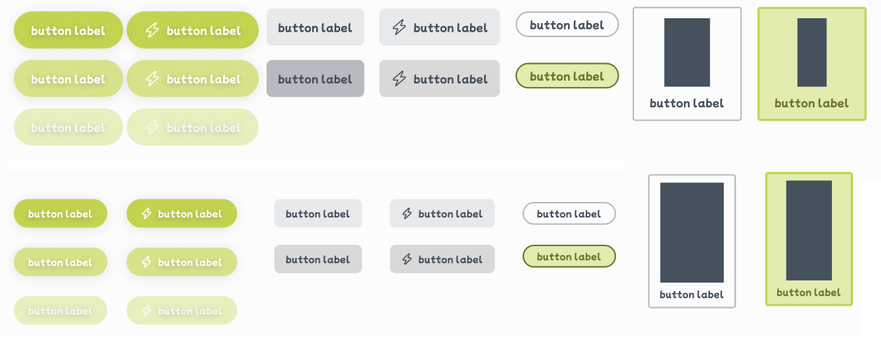
- Top: for larger device sizes
- Bottom: for smaller device sizes
Sample image in the third and fourth row source: X (Twitter)
After refining the design system, I translated those changes and built everything in code.
Next, I refined the code for drawing images on a canvas during the customization step. I also implemented two-finger scaling for resizing stickers, which involved adding three new EventListener functions:
gesturestart: touch surface registers multiple touch points (e.g. index and middle fingers on the screen), triggering a touch gesturegestureend: touch surface does not have multiple touch points (e.g. zero or one fingers on the screen)gesturechange: touch points move along touch surface during a touch gesture (e.g. index and middle finger move in opposite directions)
As aforementioned, I updated the code so that stickers now appeared scaling and rotating about their center (rather than from the top-left corner which gave me such a huge ick). ICYMI: to draw an image at the desired spot, we need to "move" the canvas to the correct coordinates. Our new desired spot is at the center of the sticker: ctx.translate(x + halfW, y + halfH), where halfW and halfH are the halved values of the sticker's width and height. Then, to draw the image: ctx.drawImage(img, 0, 0, img.width, img.height, -halfW, -halfH, halfW*2, halfH*2). The half-values are needed to correctly account for drawing a transformed image.
During a gesturechange, the event contains a scale property. If scale > 1, the touch points moved apart. If scale < 1, the touch points moved closer.
Accordingly, the x- and y-coordinates are also updated as it's resizing.
I also handled a few edge cases.
- Stickers have maximum and minimum size constraints to ensure they will never be too small or too large to interact with
- Prevent stickers from being placed outside of the
canvasby checking the x- and y-coordinates relative to the width and height of thecanvas - Added another
EventListener:mouseleave, for when the pointer device exits thecanvas- if triggered and a sticker was being interacted with, treat it as amouseupand save the interaction
For rotated stickers, the program calculates the rotated coordinates for any user input. These new coordinates are used to check whether the user has interacted with the sticker or its interactive elements. The formulae follow the standard equation for rotating a point (x, y) about another point (m, n):
- New x-coordinate:
(x - m) * Math.cos(angle) - (y - n) * Math.sin(angle) + m - New y-coordinate:
(y - n) * Math.cos(angle) + (x - m) * Math.sin(angle) + n
As I was testing and playing around with the customizations, the canvas would lag on mobile after a short period of use. I then looked for ways to optimize my code:
Essentially, after a short while, as the sticker moved on the canvas, it looked like there was an extreme drop in frame rate.
I learned that drawing on the canvas is quite an expensive operation. The issue was that the drawing function was unable to keep up with the frequency of user inputs because it was drawing so many things each time.
To address this, I optimized the drawing function by introducing a second canvas object to create a two-layer structure. The top layer held the sticker most recently added or interacted with (i.e. the last sticker in the list). The bottom layer held all the remaining stickers. Therefore, when interacting with one sticker, the program only needed to redraw that one sticker on the top layer, rather than redrawing the entire list of stickers each time.
Furthermore, during transformations, the drawing function will no longer draw the associated interactive tools. Only when a sticker was stationary and selected will the function draw the tools. As well, I went through the logic from the beginning and prevented extra unnecessary draws.
These major modifications significantly improved the drawing performance by decreasing the amount of drawings, and it no longer "lagged" on mobile.
I also added loading indicators and modal instructions:
- Integrated react-loading-skeleton by dvtng at multiple touchpoints throughout the user journey
- Prompt users to enable camera permissions to continue
- Loading states for the camera feed
- Loading states for overlay image imports
- Loading/importing the sticker images (at the customization step)
- Information "i" icon button that opens a modal with a brief instructional text snippet
Left: mobile (or smaller devices), right: desktop (or larger devices)
Then, I implemented undo and redo functionalities and quite enjoyed planning the logic. Basically, after each user action, the current "state" of the canvas is stored in an 'actions' list. If undo is triggered, the current state is moved to a new 'redo' list, and the canvas reverts to the previous state. If redo is triggered, the state is restored and returned to the 'actions' list. If a user performs a new action following an undo, then the 'redo' list is cleared.
This led me to change the cursor style during different types of user interactions with a pointer device. Specifically, I utilized the following cursor styles:
default: default cursor arrowpointer: clickable elementgrab: grabbable elementgrabbing: currently grabbingmove: moving stickerse-resize: resizable elementnot-allowed: elements that cannot be interacted with
Cursor styles are applied on various interactive elements and within the canvas during the customization step.
- Hovering over a sticker
- Repositioning a sticker
- Hovering over the sticker tools
- Hovering over the
canvas's undo and redo buttons
- Loading skeleton where the camera feed would be
- Disabled button +
not-allowedcursor style - "Back" button available
Later, I updated each canvas throughout the photo booth process to export its image as a blob instead of a standard image format (e.g. PNG). This was added as an extra detail to manage memory since I could easily delete a blob image when no longer needed: URL.revokeObjectURL(resultBlob).
My friend and I consolidated the list of border colours and camera filters. We utilized CSSgram by una, a library with Instagram-like filters, and mapped them as follows:
- 1977 → Musically
- Clarendon → Vivid
- Reyes → Light
- Inkwell → Black/White
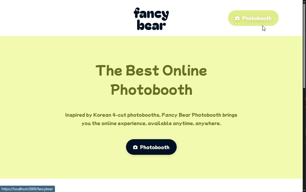
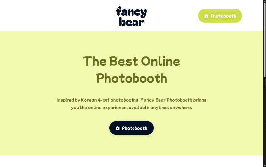
Lastly, I built the homepage, header and footer for the site. I was inspired by conventional layouts that highlight the services and features of a business, brand or company.
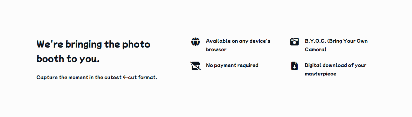
- Hero banner - CTA that led to the photo booth
- Info section 1 - generic showcase with easy, bite-sized information
- Info section 2 - overview of the photo booth process
By this point, the month of March was almost finished. I shortened the second info section and removed the last section (i.e. the fourth section in the left-most frame of the previous image) during implementation. I felt these were not essential at this stage. My friend and I also collaborated on replacing the Lorem ipsum text. As well, we created brief pages for a Privacy policy and Disclaimer for copyright material. We stated that we did not store any images and do not own the Love and Deepspace content used.
Since this was a website rather than a downloadable application, the header and footer should still be interactable by scrolling. As the user proceeds to the next step, the screen scrolls automatically so the photo booth interface occupies the entire device screen. Similarly, during the photo capture process, I disabled page scrolling to keep users within the main photo booth view. This helps prioritize the visiblity of the photo booth process and fix accidental scrolling on all devices.
Finally, we published the latest version of our photo booth. Check out the website linked here! Or, check out the README.md here!
💭 Next Steps
My friend and I plan to update the photo booth with new frame designs. As our brand develops, we could add supplementary pages such as "About Us" or a viewable list of available frames.
Some of the camera filters did not function properly and required several makeshift workarounds. This was due to differences in how blend modes work between CSS and Canvas, and that I couldn't directly apply filters onto the EDIT: I have significantly improved (and basically fixed) how the camera filters worked when applying to an image. The only caveat is that, on mobile, I am unable to retrieve decimal values from <video> element due to the way the CSSgram library functions. Therefore, I'll need to figure out exactly how to proceed with filters.css properties. For example, if an element has property opacity: 0.5, getPropertyValue('opacity') returns an empty string. Retrieval of regular properties (e.g. getPropertyValue('mix-blend-mode')) functions just fine. So, there's that.
A different friend mentioned the ability to save, share or send the finished result to another device or across devices. I added a "Share" button to enable quick access to sharing options via the Web Share API. This was my quick solution to their suggestion, but I'd like to investigate this further down the line.
Lastly, the canvas I built has plenty of room for improvement. Either I get my hands dirty again or I will continue searching for a usable library. Nonetheless, I'm incredibly proud of what we have built.